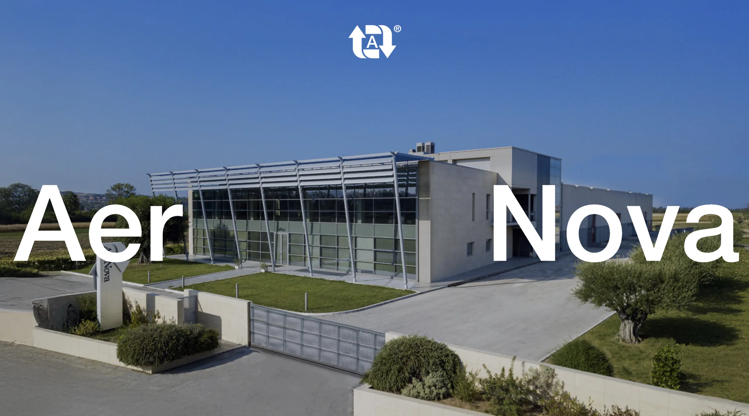
AerNova designs and manages air treatment systems.
The project redefines identity, positioning, and voice, from product to relationship.
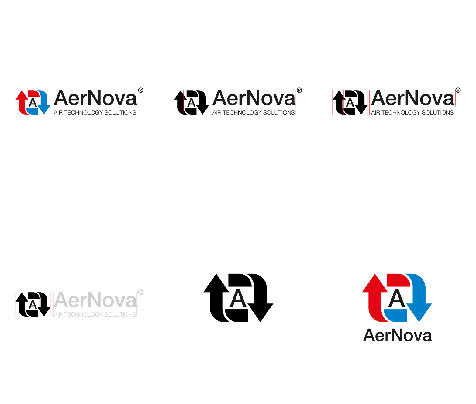
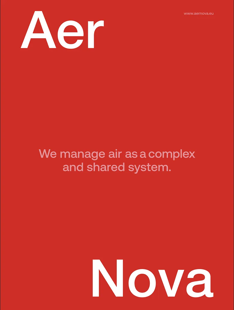
The project redefines AerNova's identity to consistently reflect the company's evolution and its new positioning. From naming to payoff, from the brandmark to the visual language, through to the tone of voice and brand applications, every element contributes to building a unified brand system. The goal is to present AerNova not merely as a manufacturer of air treatment solutions, but as a partner capable of supporting clients and designers in managing complex scenarios.
Services
Brand identity
Social media
Editorial design
Tradeshow
Client
Place
Year
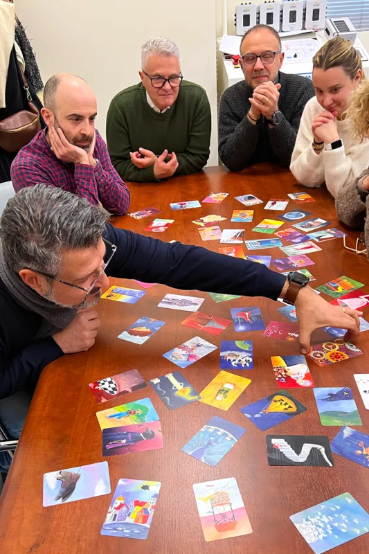
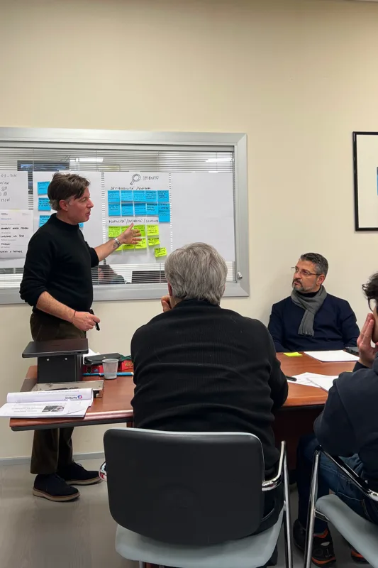
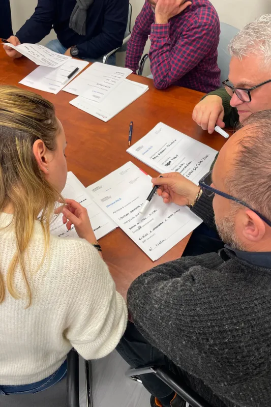
Facilitation
A shared journey before identity:
together with the team, we focus on the values and direction upon which to build the positioning.
Feedback and comparative analysis
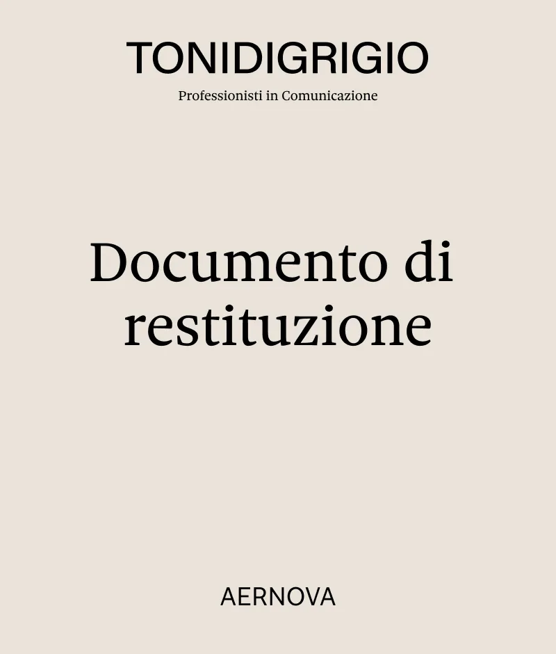
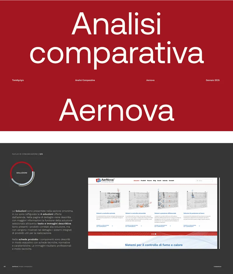
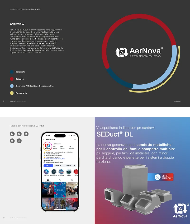
Communication cores
Corporate
Solutions
Responsibility
Partnership
Identity
A positioning that goes beyond technology:
the current payoff tells what AerNova does, not the role it has chosen to adopt. Naming, payoff, and visual system are redesigned for this shift: from supplier to partner.
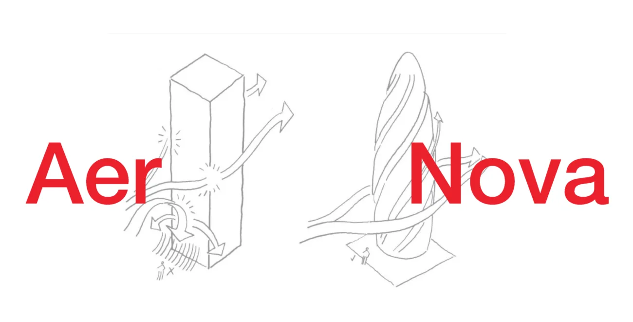
New positioning
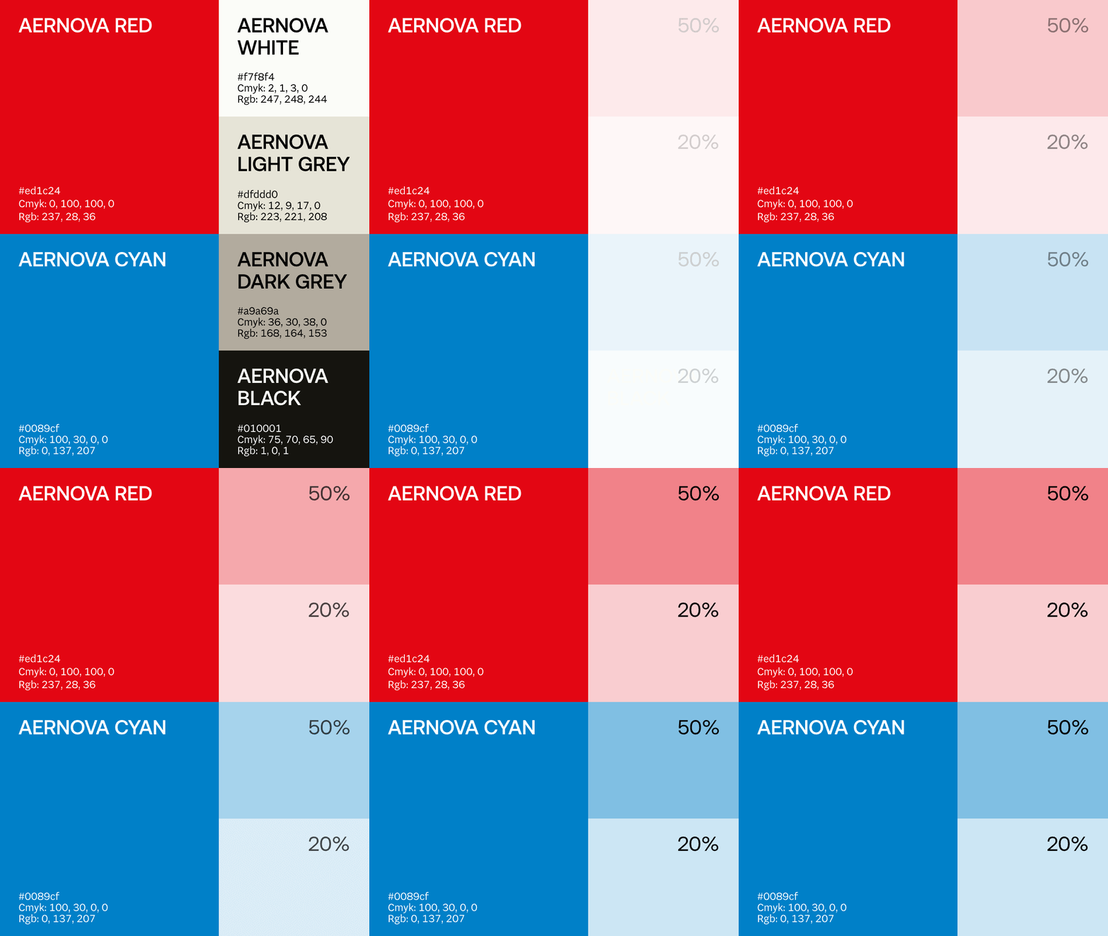
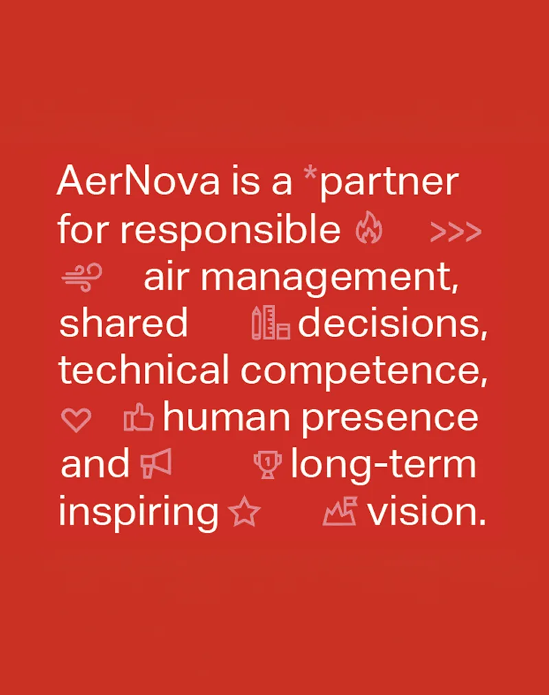
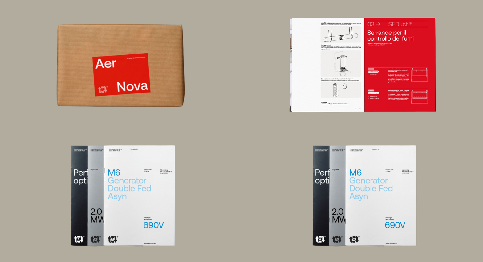
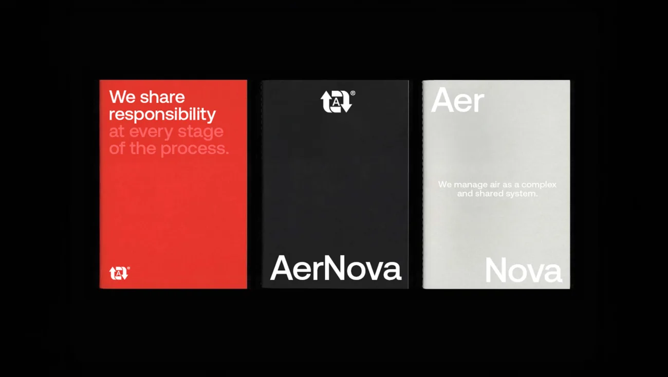
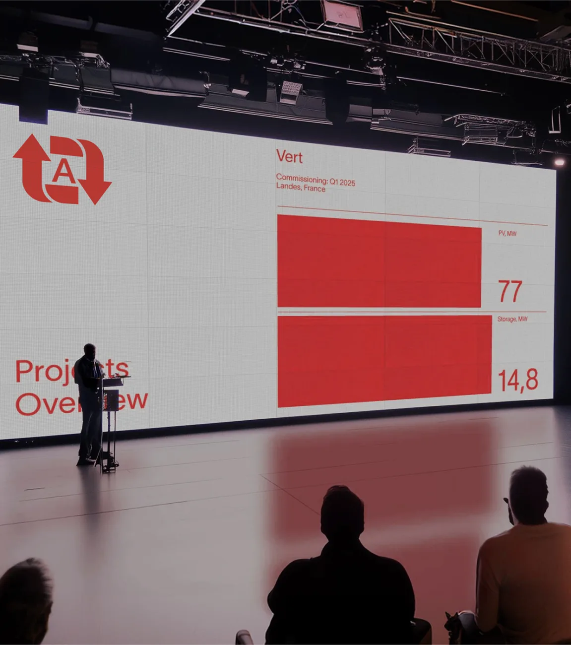
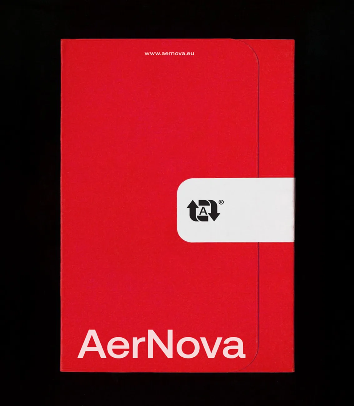
The typography shifts to Aeonik, which introduces a more distinct contrast compared to Helvetica while remaining refined and professional, suitable for both body text and positioning statements. The color palette retains AerNova's historic red and cyan, expanding them with a scale of neutrals from white to black and variations in saturation, adapting to different digital and print contexts without losing brand recognition. Icons and glyphs share the same typographic language, integrating seamlessly into text as part of the sentence.
Separation as a system
The name splits into two core meanings: Aer, the air as an invisible yet vital space, and Nova, the change that renders it visible and controllable. In the logotype, the space between the two words becomes part of the system—expanding and contracting, evoking the rhythm of breath and the flow of air. The empty space is not an absence, but the very condition that allows the system to function.
Content strategy
From the system to everyday content:
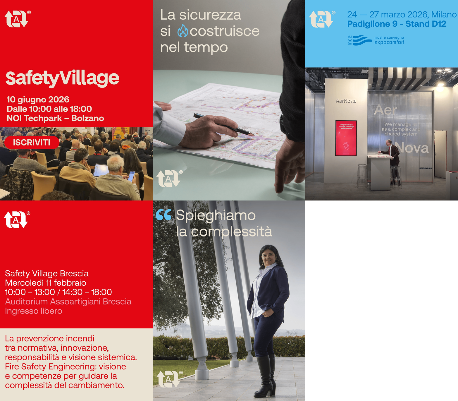
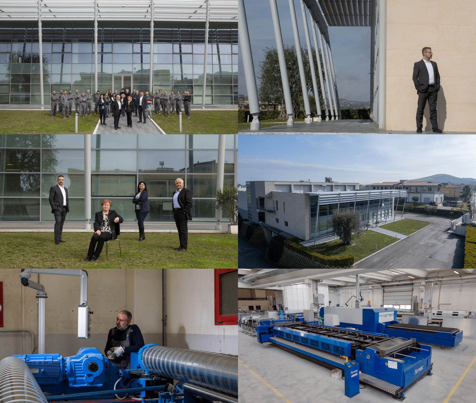
headquarters, production, and people portray AerNova without straying from the tone established for the brand.
Images of the headquarters and production line alternate with the faces of the people who work there and the key moments when AerNova connects with the market—from industry trade shows to events like SafetyVillage. The subject changes, but the tone remains consistent: direct and technical when needed, never overly promotional.

Tool
Speaking to different audiences:
the catalog and company profile apply the system to content aimed at the market and partners.
Catalog
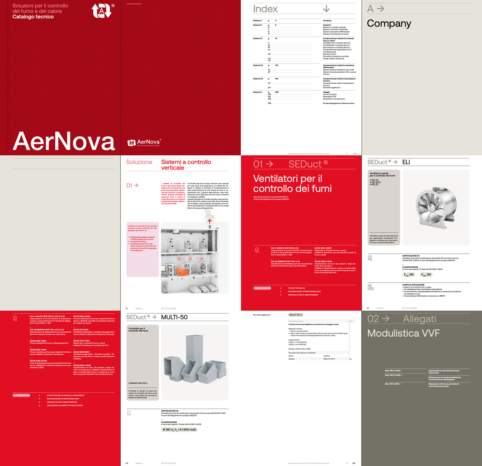
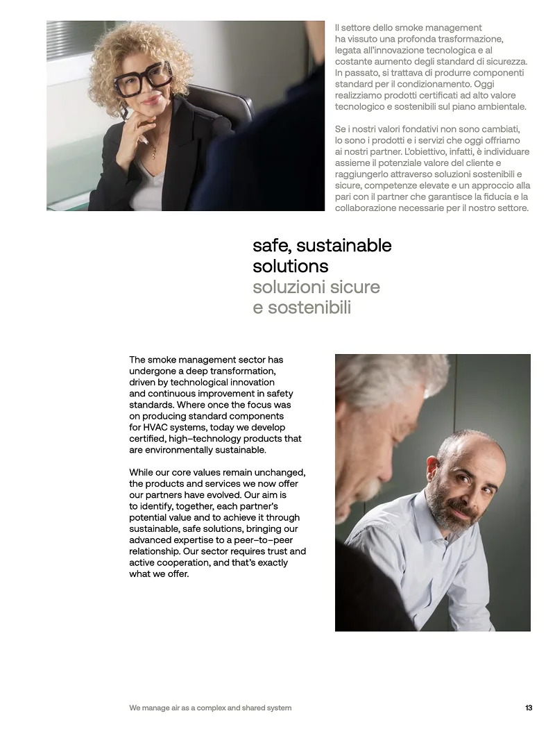
The catalog gathers products and solutions using the same visual system developed for the brand: palette, typography, and iconography remain consistent, while the language becomes more technical to explain the features of each system.
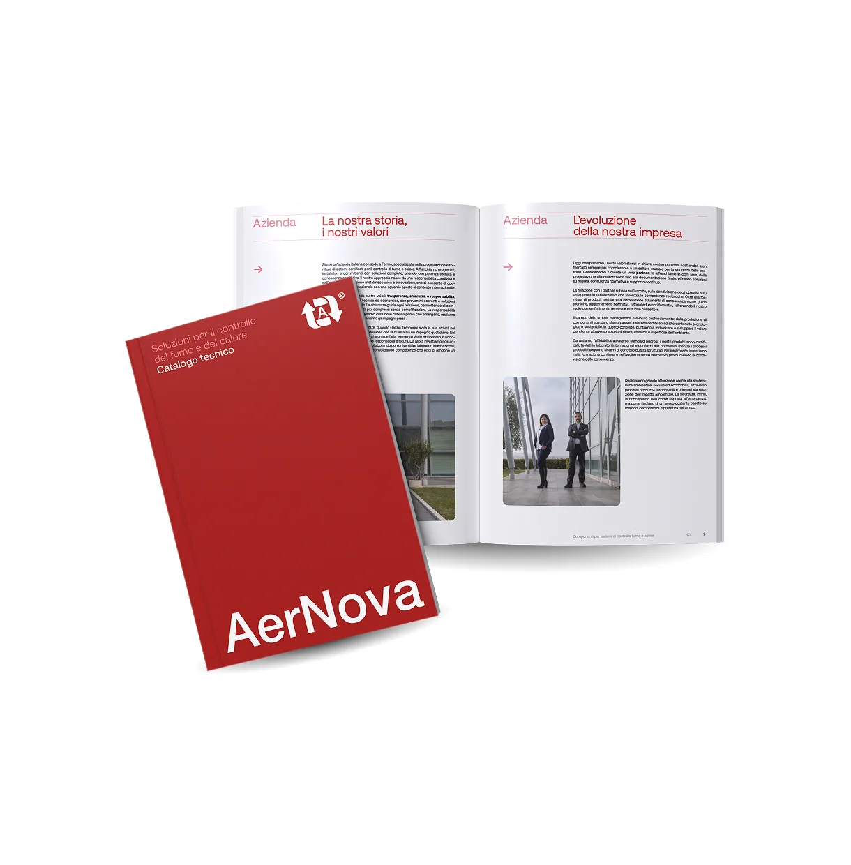
The company profile, on the other hand, tells the broader story of the company—its values and the role of partner that AerNova has chosen to adopt—using a more narrative tone. Two tools with different audiences and objectives, yet built on the very same identity system.
Company profile
Redesigning AerNova's identity meant shaping something that exists but cannot be seen: air, responsibility, and the way the company cares for those by its side.

Jacopo Bartolucci
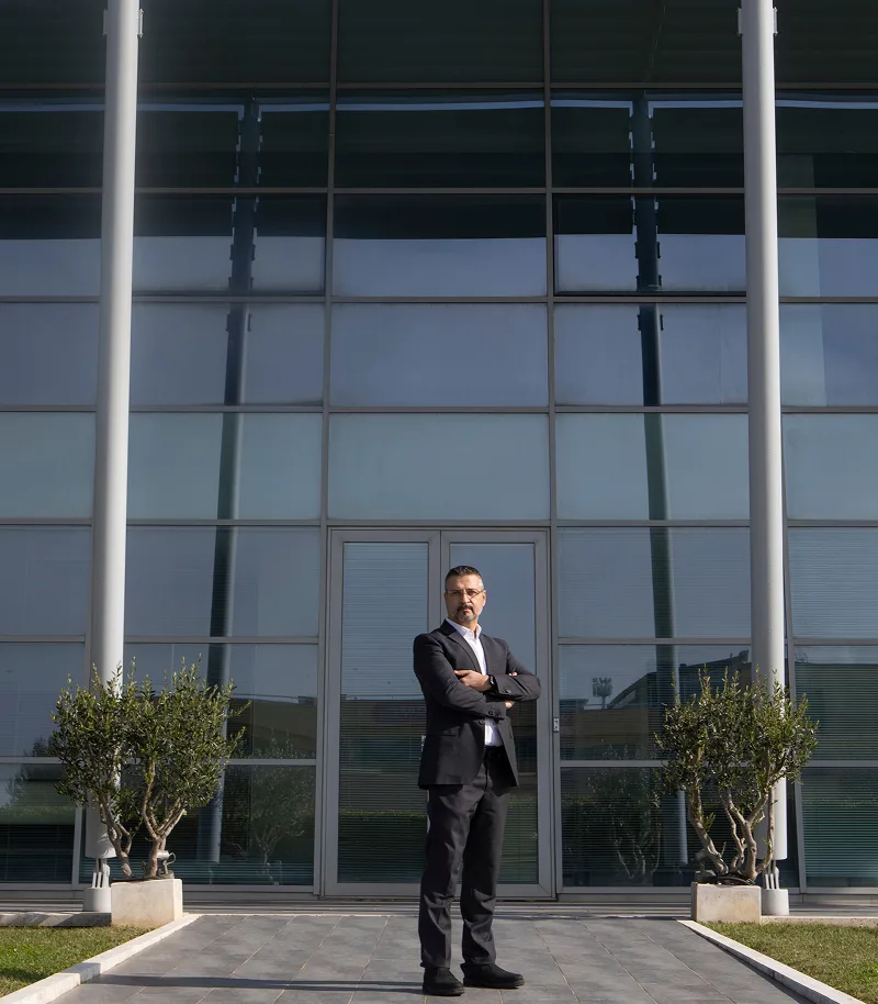
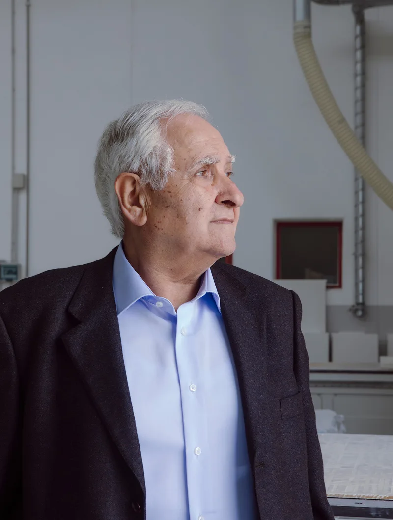
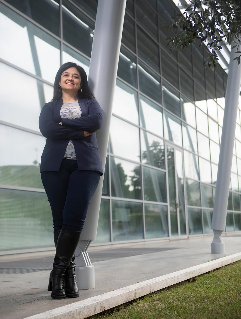
Shooting
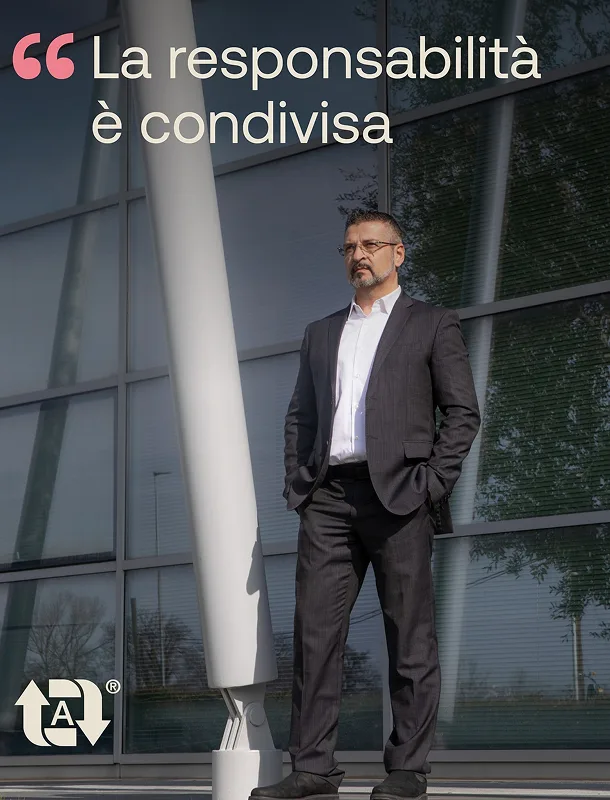
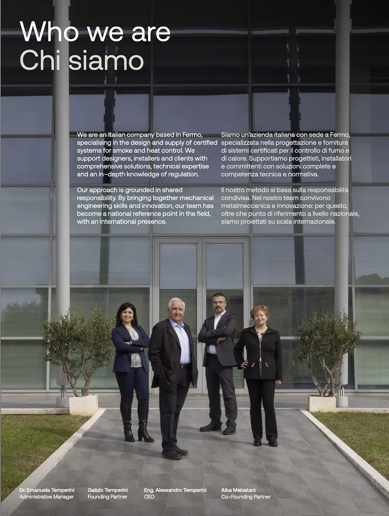
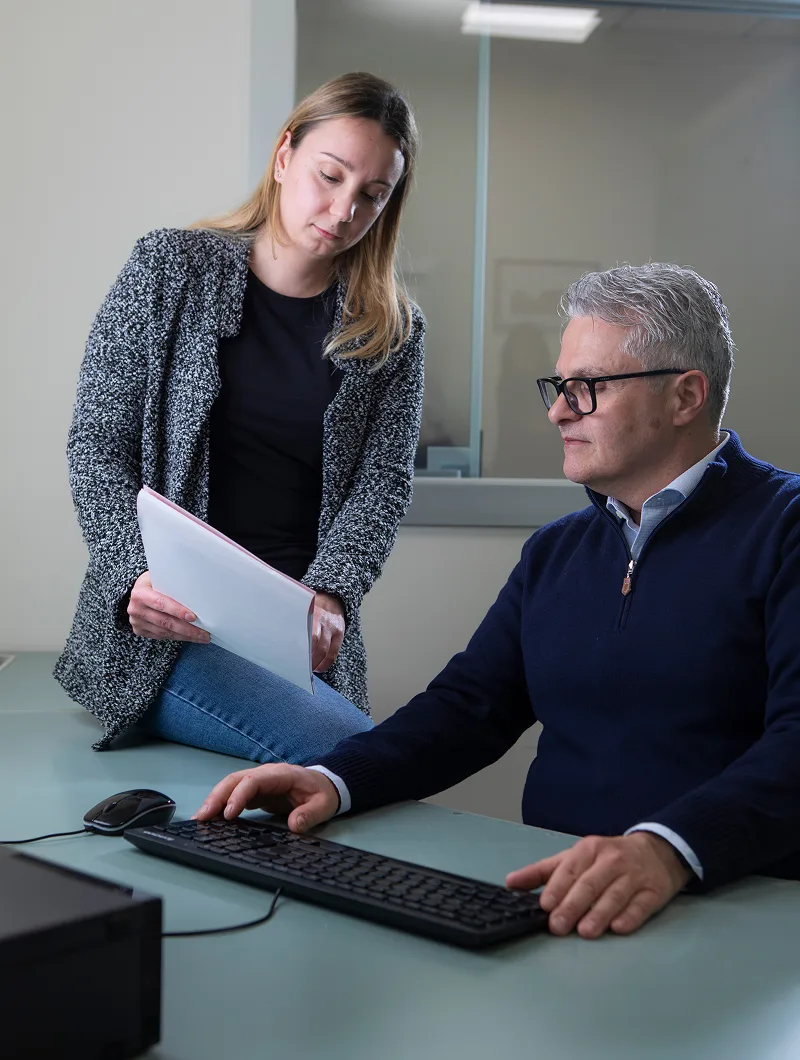
The photoshoot tells AerNova's story
through the people and spaces that define its identity.
Portraits, work scenes, and views of the headquarters build an authentic narrative of the company, highlighting the know-how, technical approach, and solidity that define every project. A photographic language consistent with a brand that makes quality, safety, and reliability its distinguishing values.
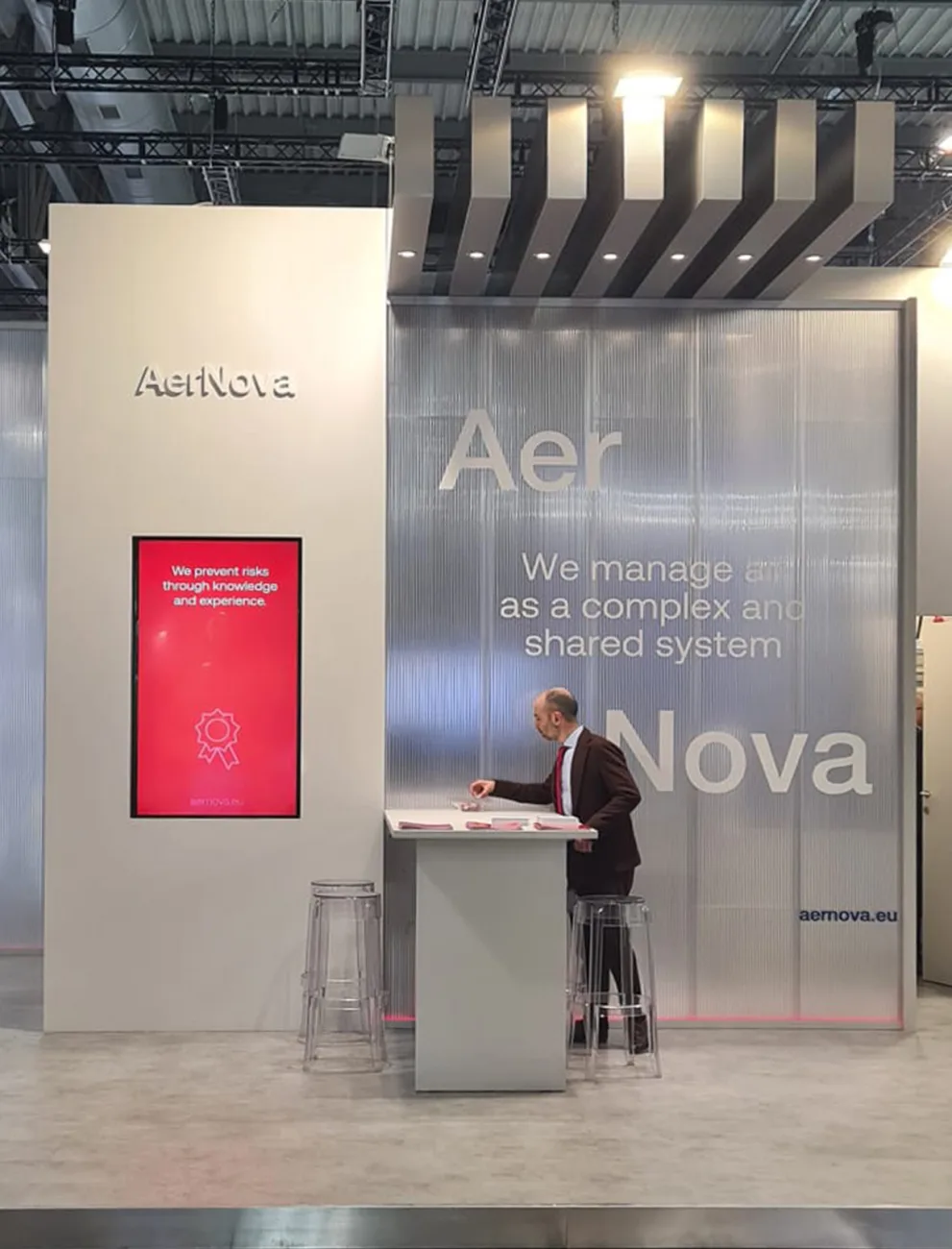
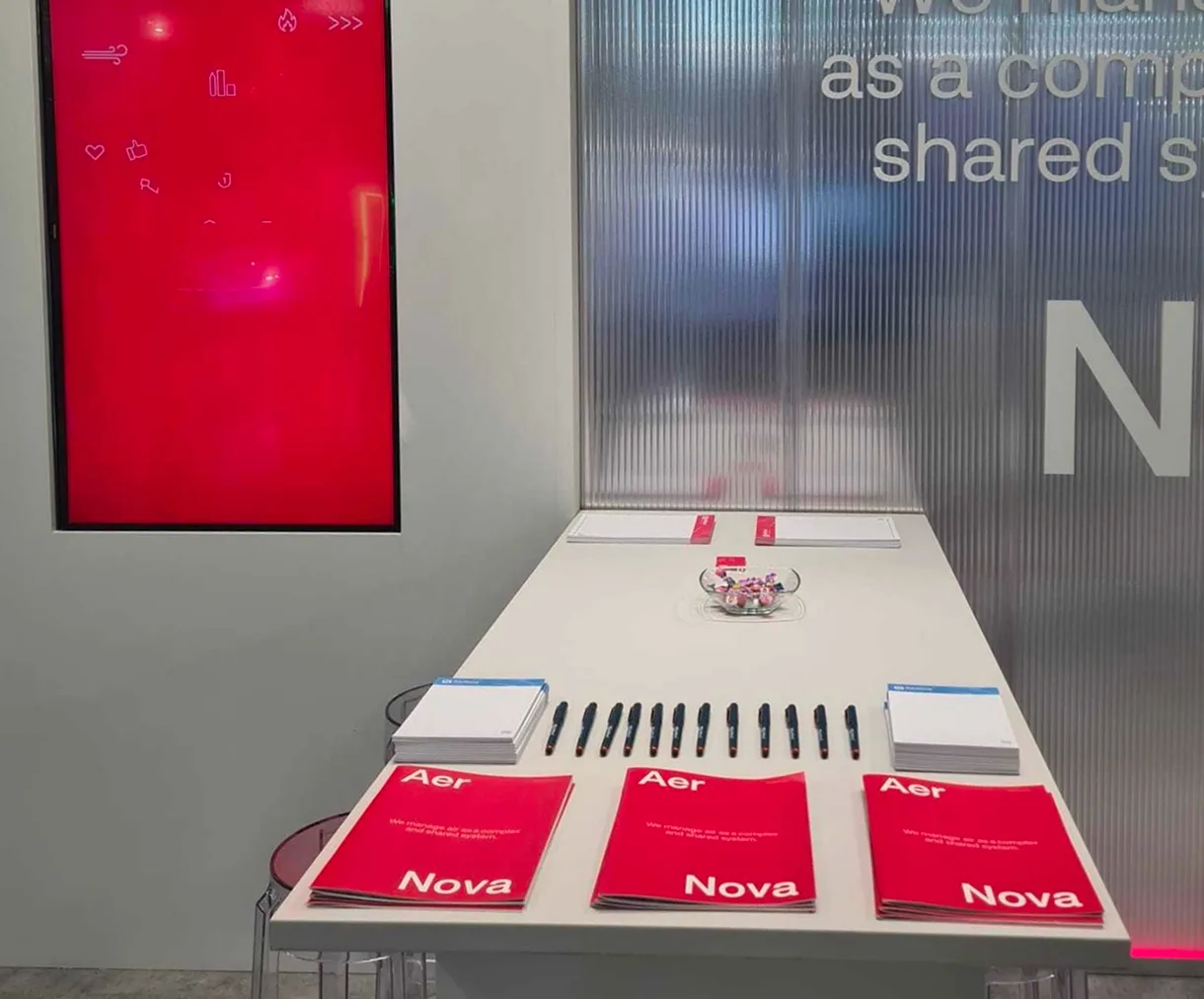
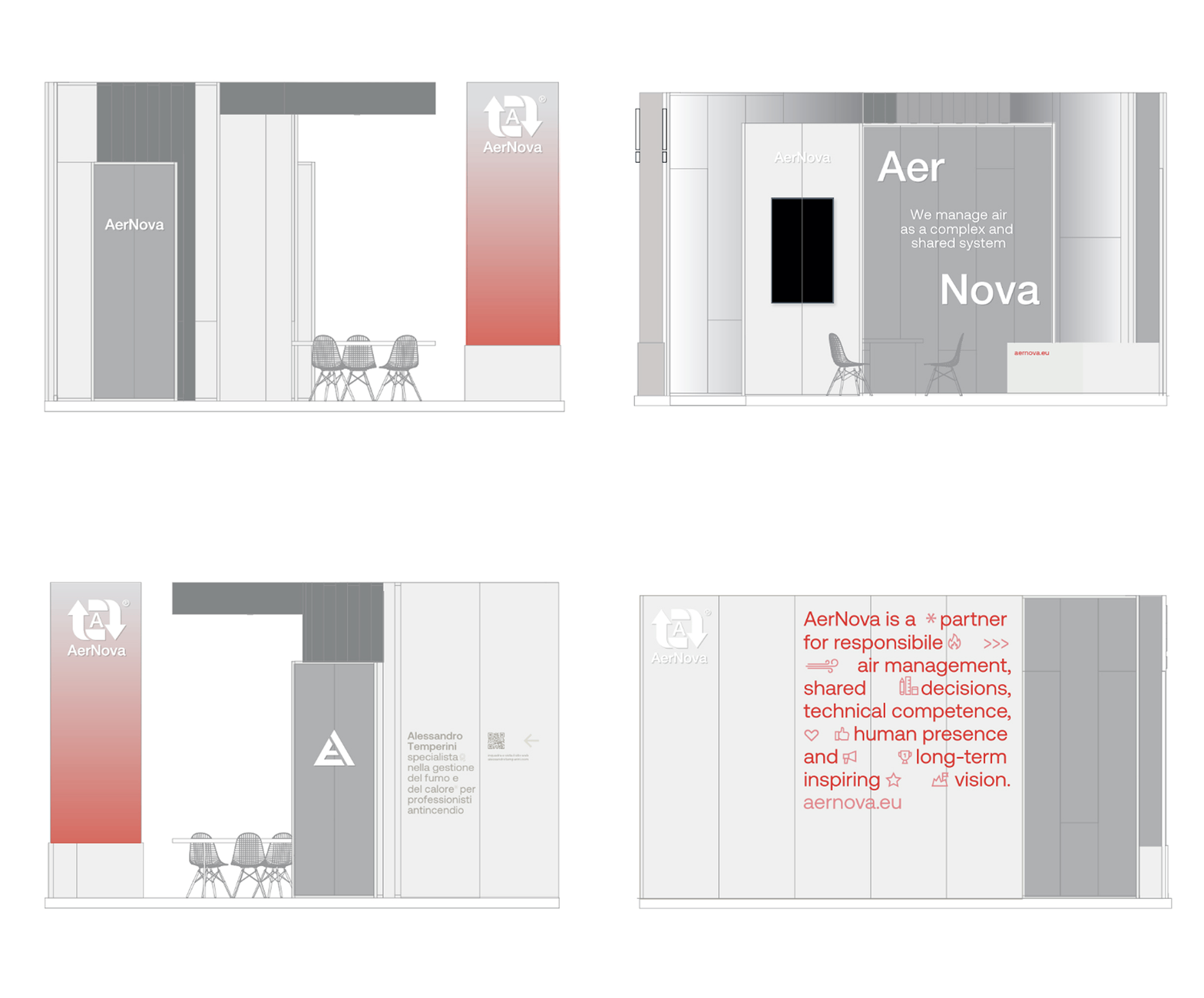
Stand
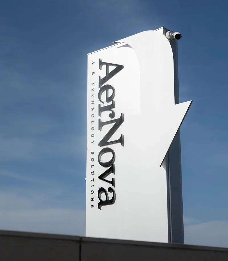
The booth designed for AerNova
translates the brand’s identity into an essential and recognizable space.
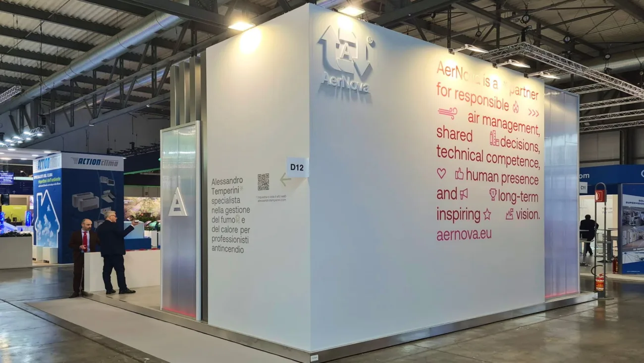
Clean volumes, bright surfaces, and integrated communication guide visitors through an experience that highlights technical expertise, innovation, and design quality. Conceived as a space for meeting and exchanging ideas with industry professionals, the booth strengthens AerNova's positioning during MCE - Mostra Convegno Expocomfort, one of the premier international events dedicated to HVAC&R systems, energy efficiency, and building comfort technologies.