meal
distribution
specialists
Client
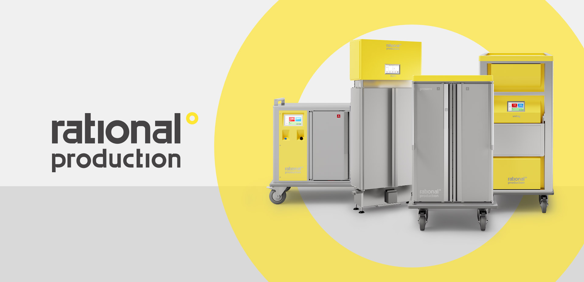
Rational Production
Location
Albano S. Alessandro (BG)
Year
2023
Rational Production designs, manufactures, and markets modular systems and solutions for meal transport, distribution, maintenance, and regeneration in institutional catering across Italy and in over 40 countries worldwide. They meet their customers' hygiene, safety, and food quality needs with an innate dedication to research and innovation.
COMMUNICATION PILLARS
They correspond to the three macro-categories of topics most widely used within the reference sector. The communication pillars considered for the purpose of this analysis consist of the following topics:
PRODUCT

This is the pillar dedicated to products and to telling the story of how they are manufactured and marketed. It corresponds to technical content and everything that allows users and customers to explore features, key benefits, and technology in detail. Communication tools useful for this narrative also flow into this pillar.
HUMAN
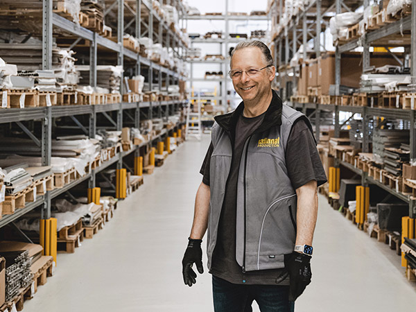
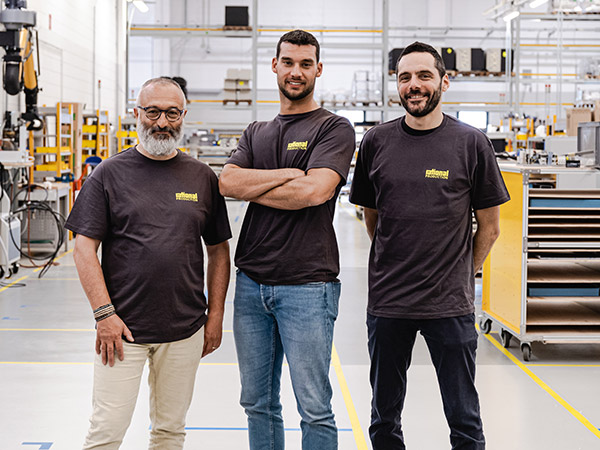
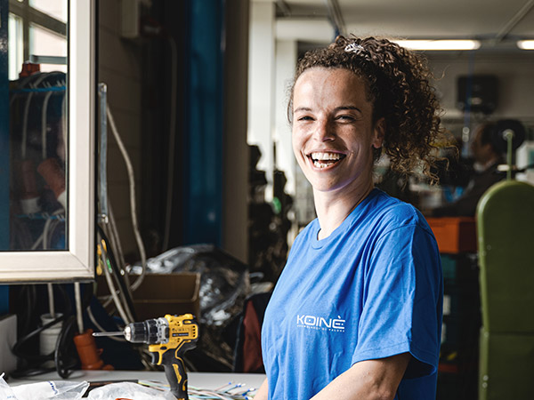
This is the pillar dedicated to people, understood both as customers and stakeholders. The sector in which the companies in this comparative analysis operate is highly delicate, and in this pillar we describe all content related to customer care and reassurance in terms of safety and attention.
ENVIRONMENT
This is the pillar dedicated to the environment and the context within which the company operates. It contains topics related to the target markets for product communication and, at the same time, the company's impact on its environmental context, addressing key issues of sustainability and social responsibility.

NAMING AND PAYOFF
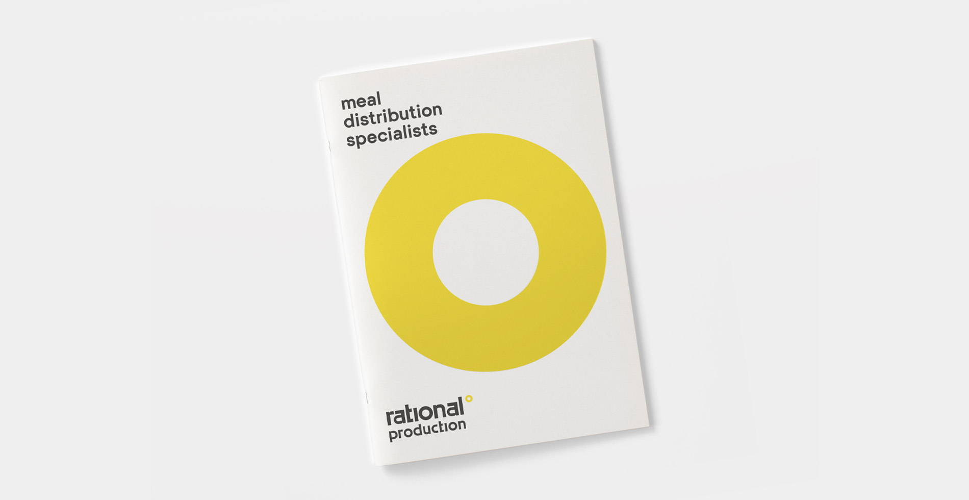
Rational Production maintains its name, ensuring continuity with the company's history and brand recognition. The naming is enriched by the payoff, which, through the term "Specialists", aims to convey Rational Production's positioning not only in the development and handling of temperature-controlled trolleys, but across the entire meal distribution ecosystem.

CONCEPT
The rebranding project finds its origin in the corporate logo. It contains all the core elements around which the entire communication project was developed.
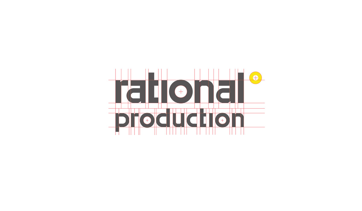
First, the geometric nature of the typography: the base font was modified to make the logotype more geometric and modular, evoking the themes of precision and product versatility.
Second, the circular element, initially representing temperature gradation, transforms to host content related to the entire communication framework, fulfilling a different function each time.

LETTERING
The typography was calibrated on the same modules used to construct the Rational Production logo, creating consistency across all applied graphic elements.
PRODUCT AND TECHNOLOGY NAMING
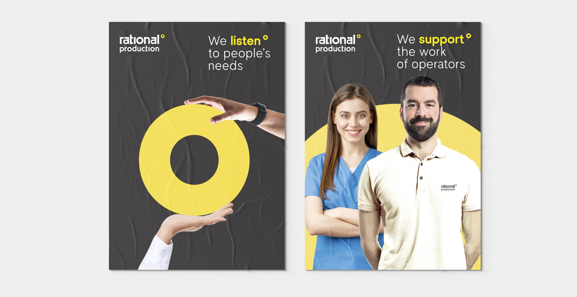
we listen°
we care°
we support°
TONE OF VOICE
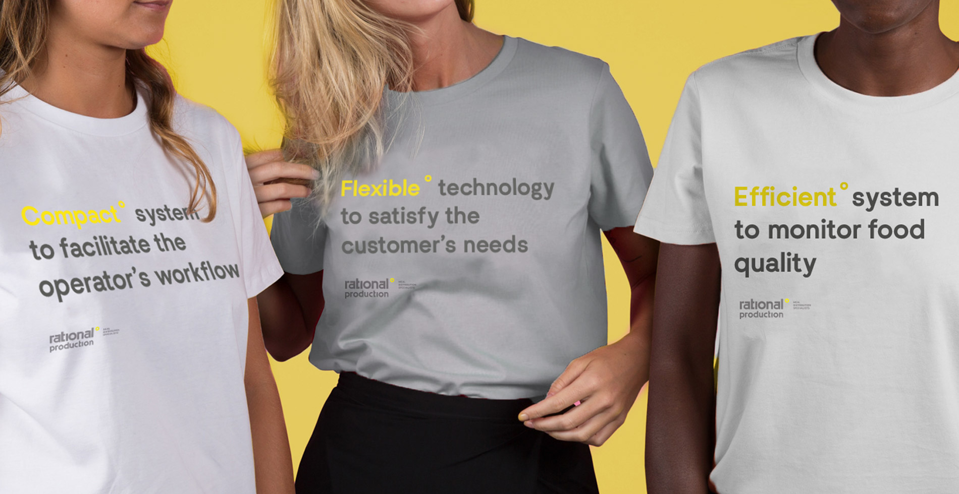
The circular element characterizing the logo is used as a highlighter to draw attention to key concepts; individual words can also be differentiated chromatically.

VISUAL IDENTITY
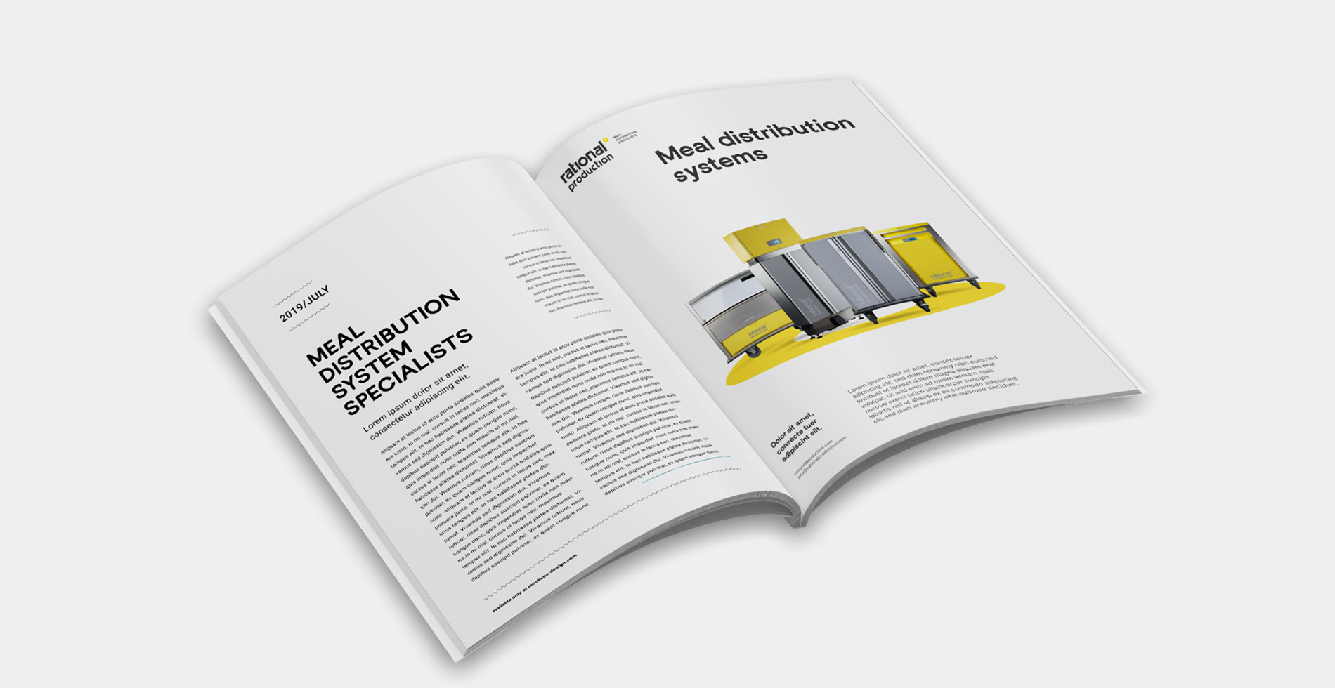
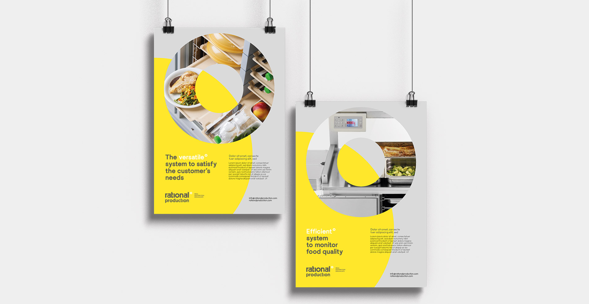
The product is the primary subject of the communication strategy. It is placed in relation to the circular element, which takes on different functions depending on the situation and communication tool:
Framing / Scenic / Informative
BRAND IDENTITY ON PRODUCTS
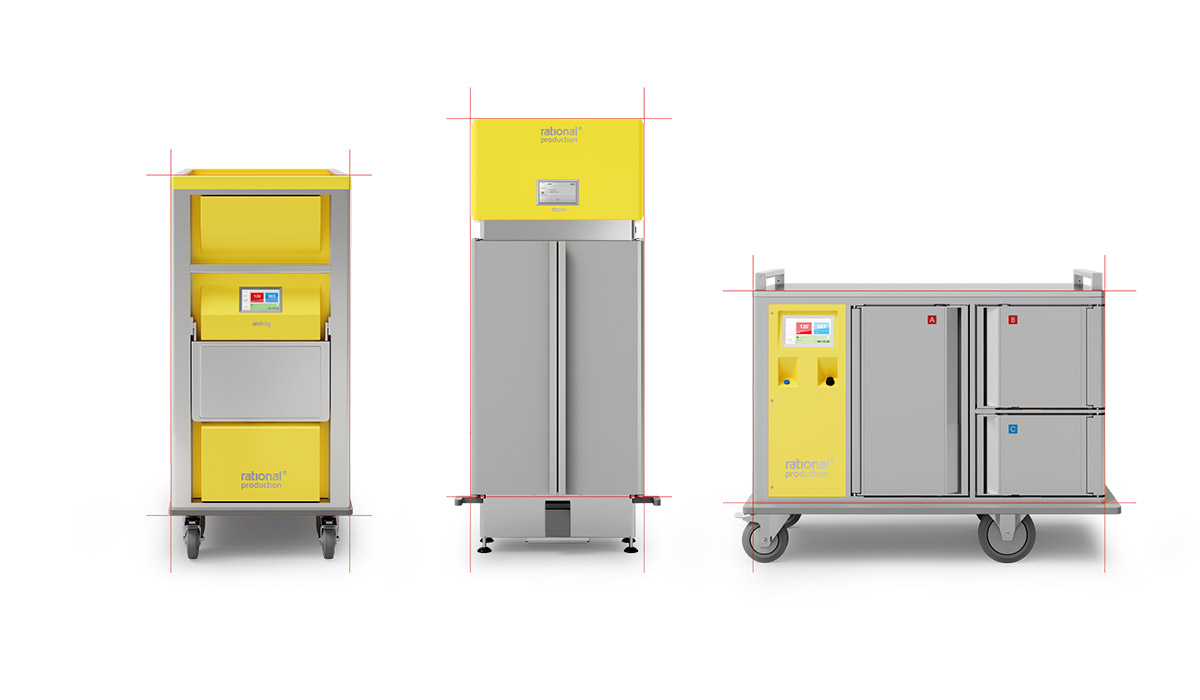
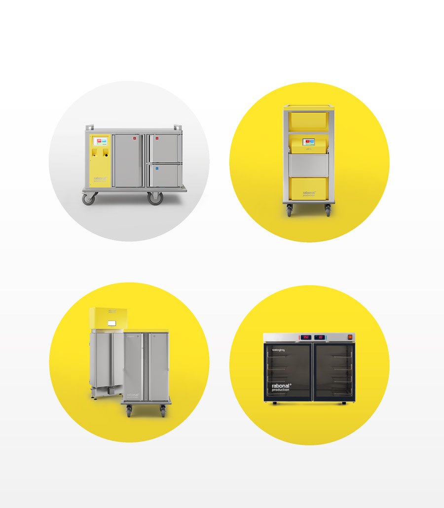
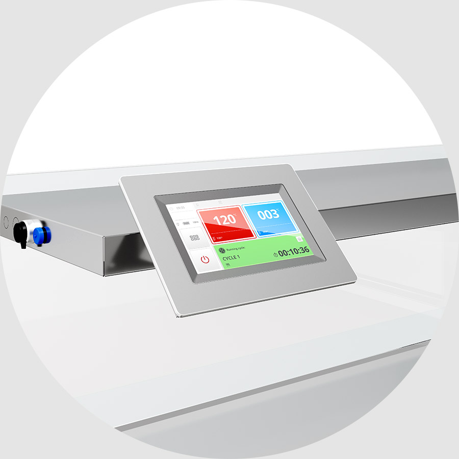
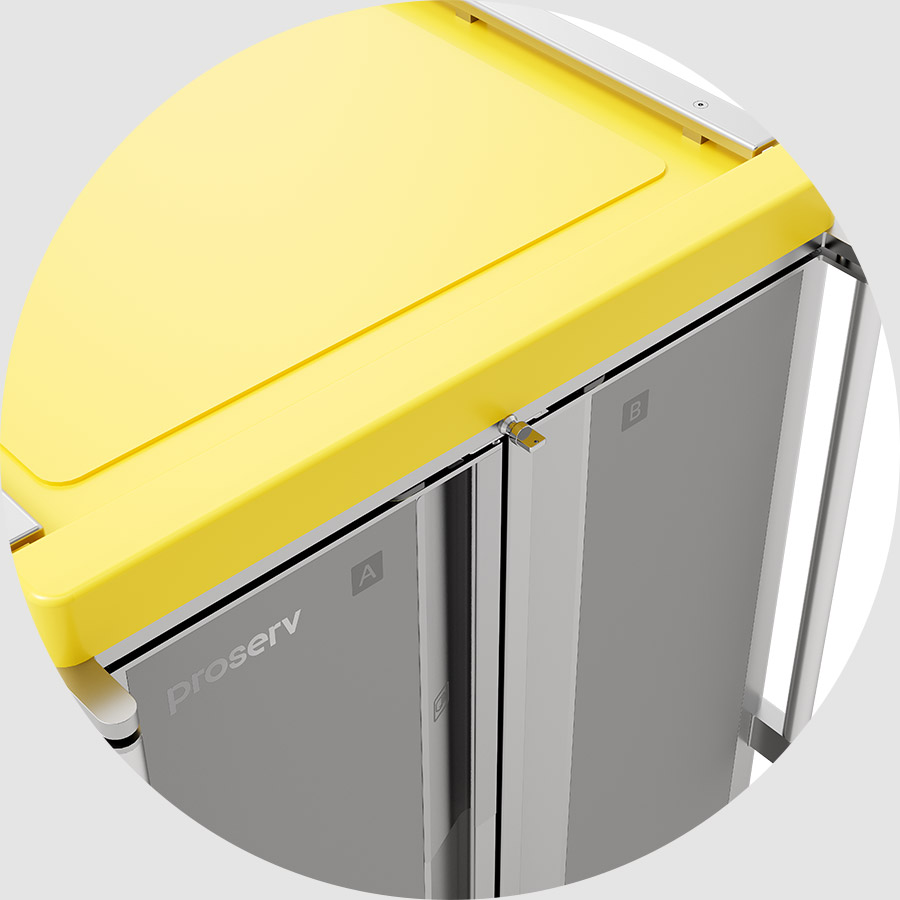
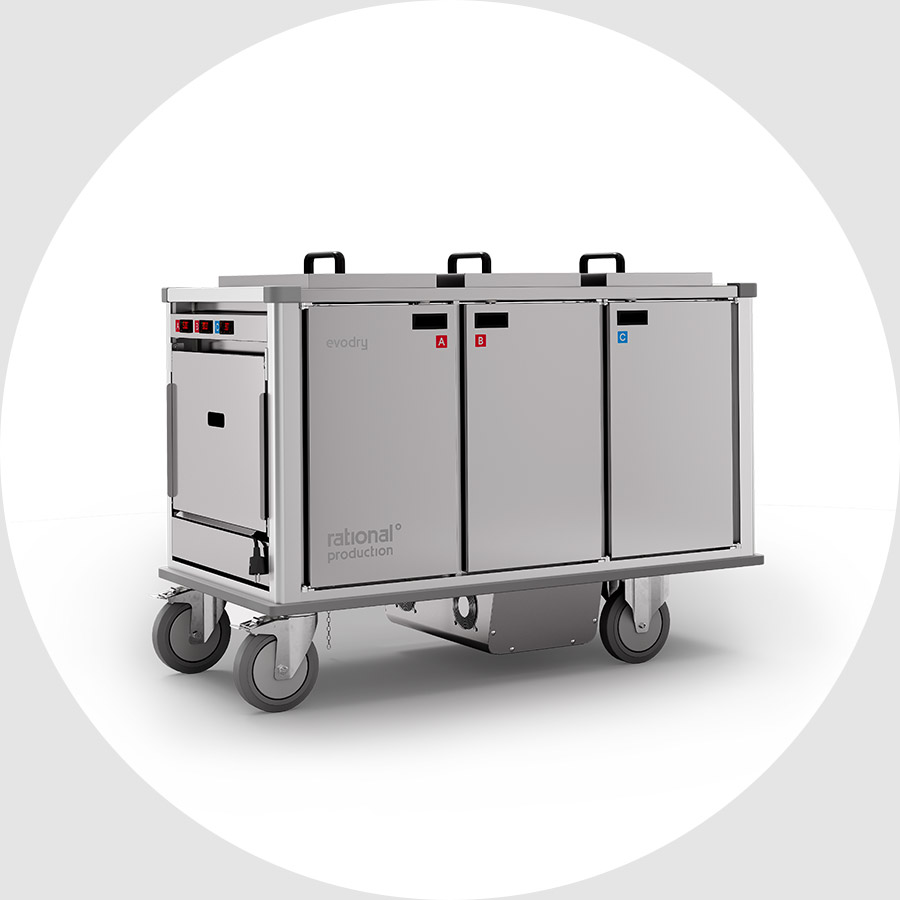
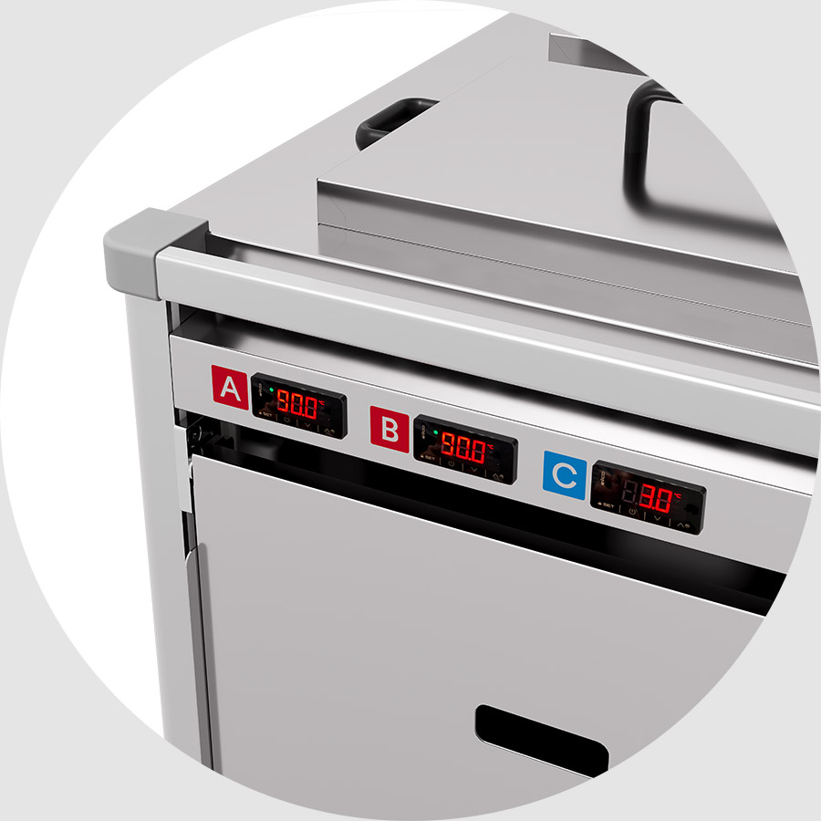
Every application of the logo and product name was carefully adapted to the specific dimensions of each product. Additionally, special attention was paid to proportional consistency across all products in the line, ensuring a uniform and recognizable brand image.
DIGITAL STRATEGY
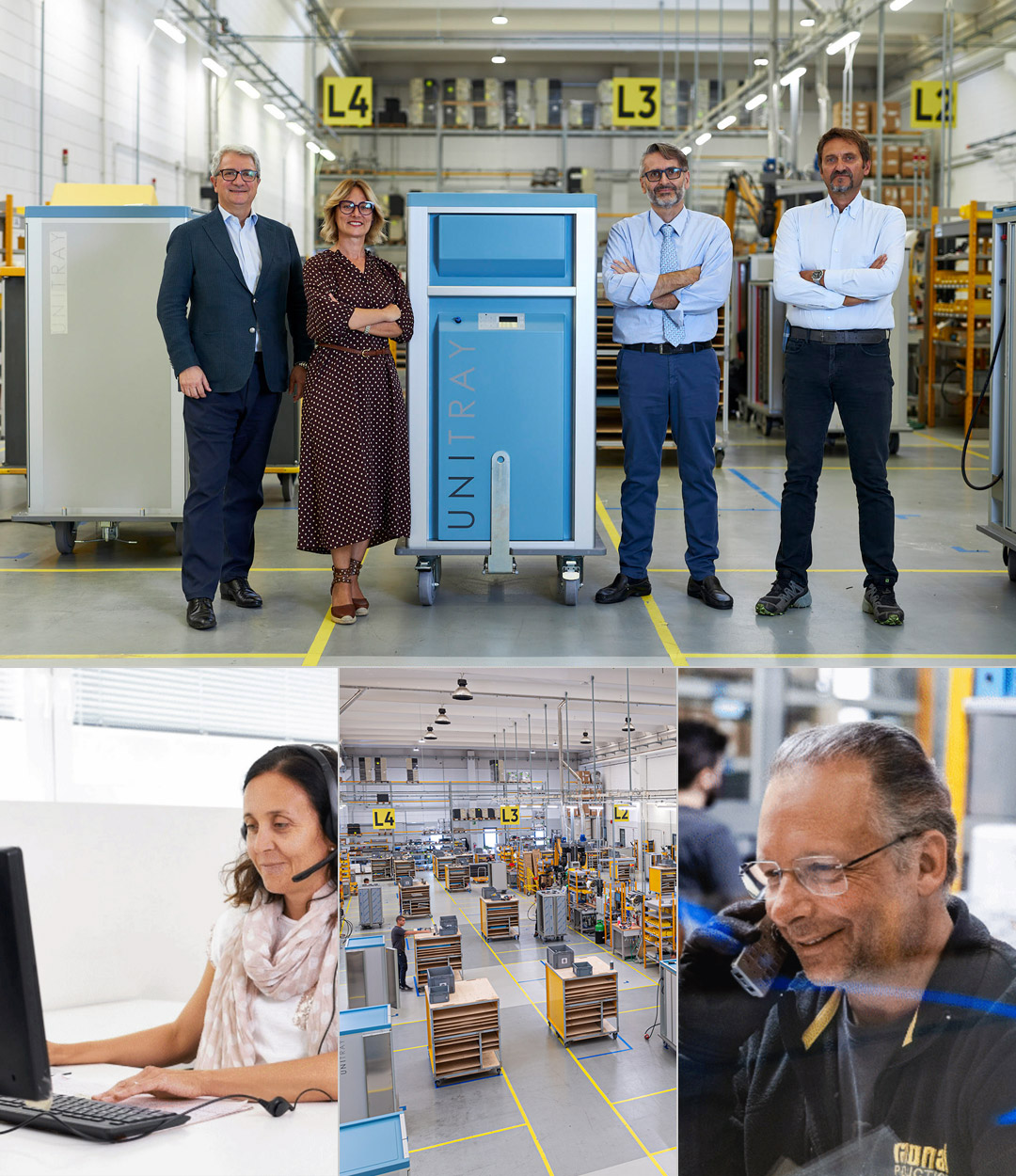
The main goal is to expand brand visibility and awareness through professional social media channels. Three communication spheres are addressed: the human side with a strong human presence, the product pillar focusing on products and technologies, and finally the environment value for sustainability-related content.


WEB
We developed the new website by analyzing the previous one and selecting key elements for communication. The result is an advanced template in line with the new brand messaging—an agile, user-friendly tool for all visitors.