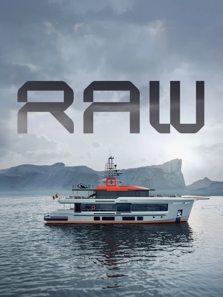
Cantiere delle Marche has been building explorer yachts in steel and aluminium in Ancona since 2010.
In its fifteenth anniversary year, the communication reaffirms the principle the shipyard has always worked by: first you do it, then you talk about it.
Cantiere delle Marche is among the international leaders in explorer yachting. A company that built its positioning by sailing, even before telling its story. The fifteenth anniversary becomes the opportunity to reorganize communication around a principle that was already rooted in the shipyard’s way of working: the alignment between what is done and what is said. Identity, website, campaigns, video production, and social channels are rewritten starting from here. Not a new story, but the story that corresponds.
Services
Brand identity
Advertising
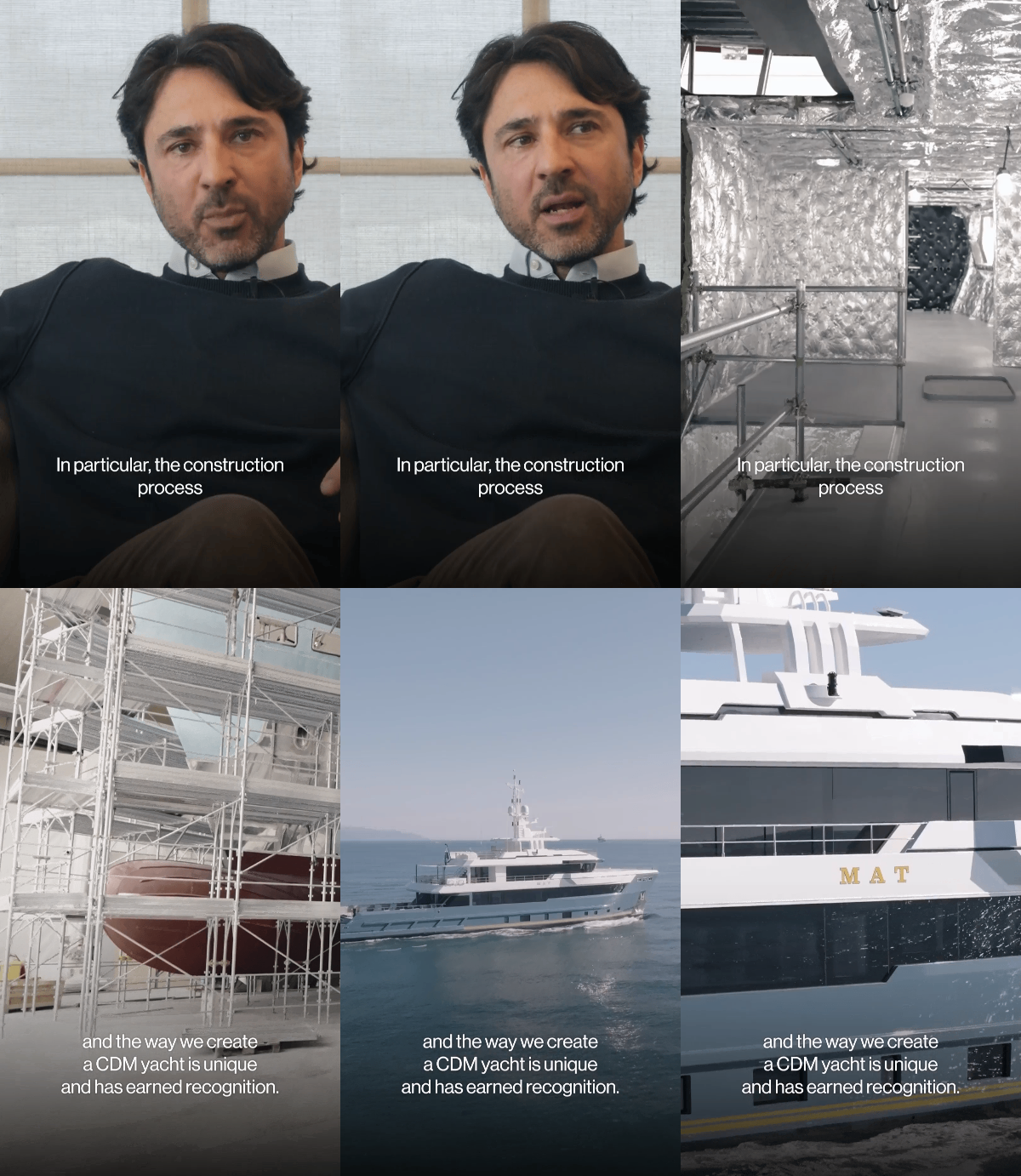
Video production
Social media
UX UI design
Copywriting
Client
Place
Year
Communication cores
Explorer
The world of navigation
Product value
Personal experience
Identity
An identity that adds nothing:
it organizes what the shipyard already is, and makes it articulate.
The alignment
The 15th anniversary could have been a celebration. We chose to treat it as a verification. The identity manifesto stems from a rule that the shipyard already followed without ever having written it down: first we do, then, if necessary, we say it. Every word of communication thus becomes the reflection of a fact, a construction choice, a navigation experience. Not a style to adopt, but a way of being in the world to recognize.

Explorer is not a claim
"Explorer" had become a common word in the industry, applied to a line or layout. The new positioning restores its true meaning: something proven mile after mile. CdM does not build explorer yachts; it builds yachts that explore.
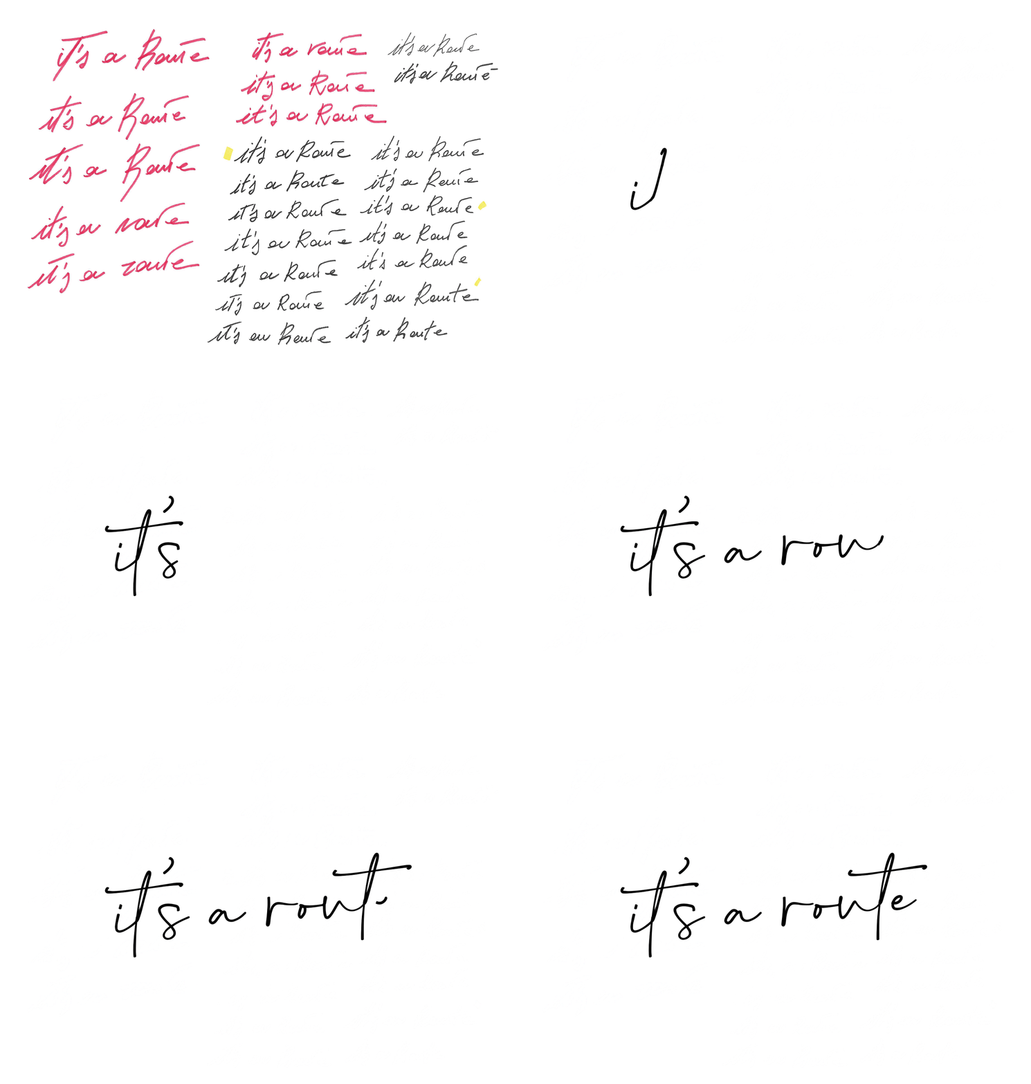
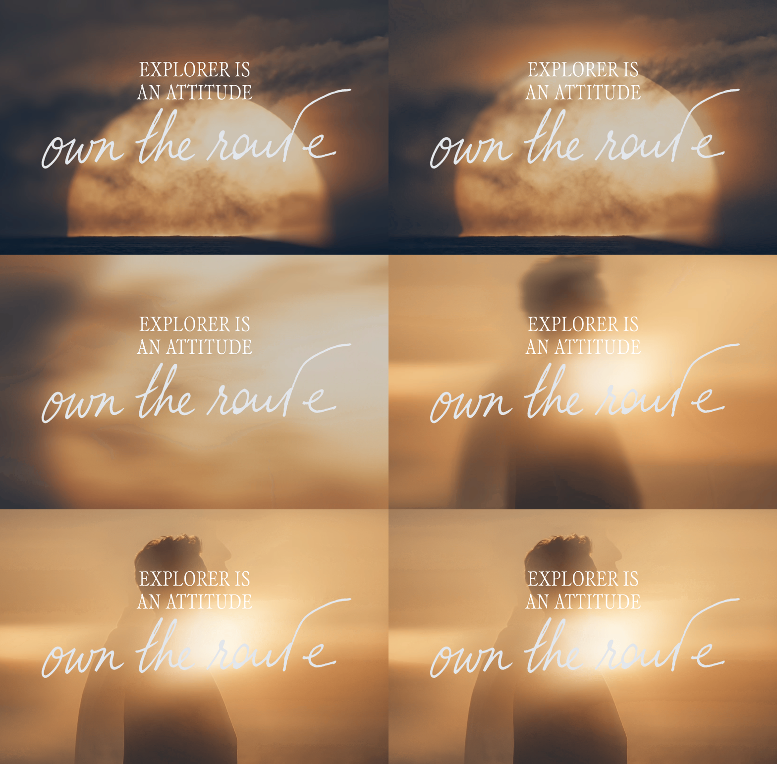
The transition takes shape through typography. The statement remains in serif; the signature shifts to italics, a personal gesture from those who built the yacht. Two voices, two distances: the route is not announced, it is signed.
Light, matter, color
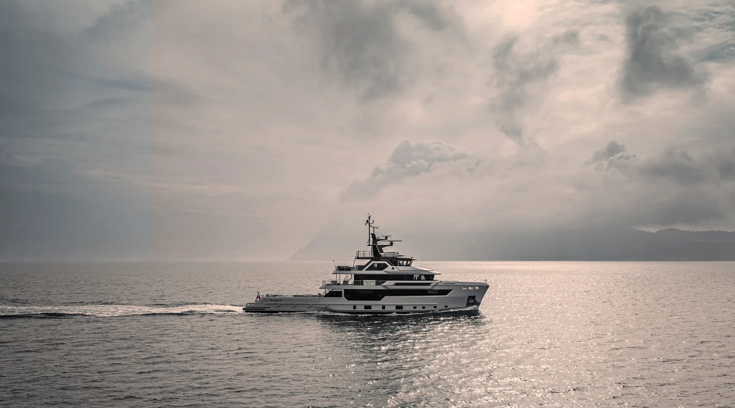
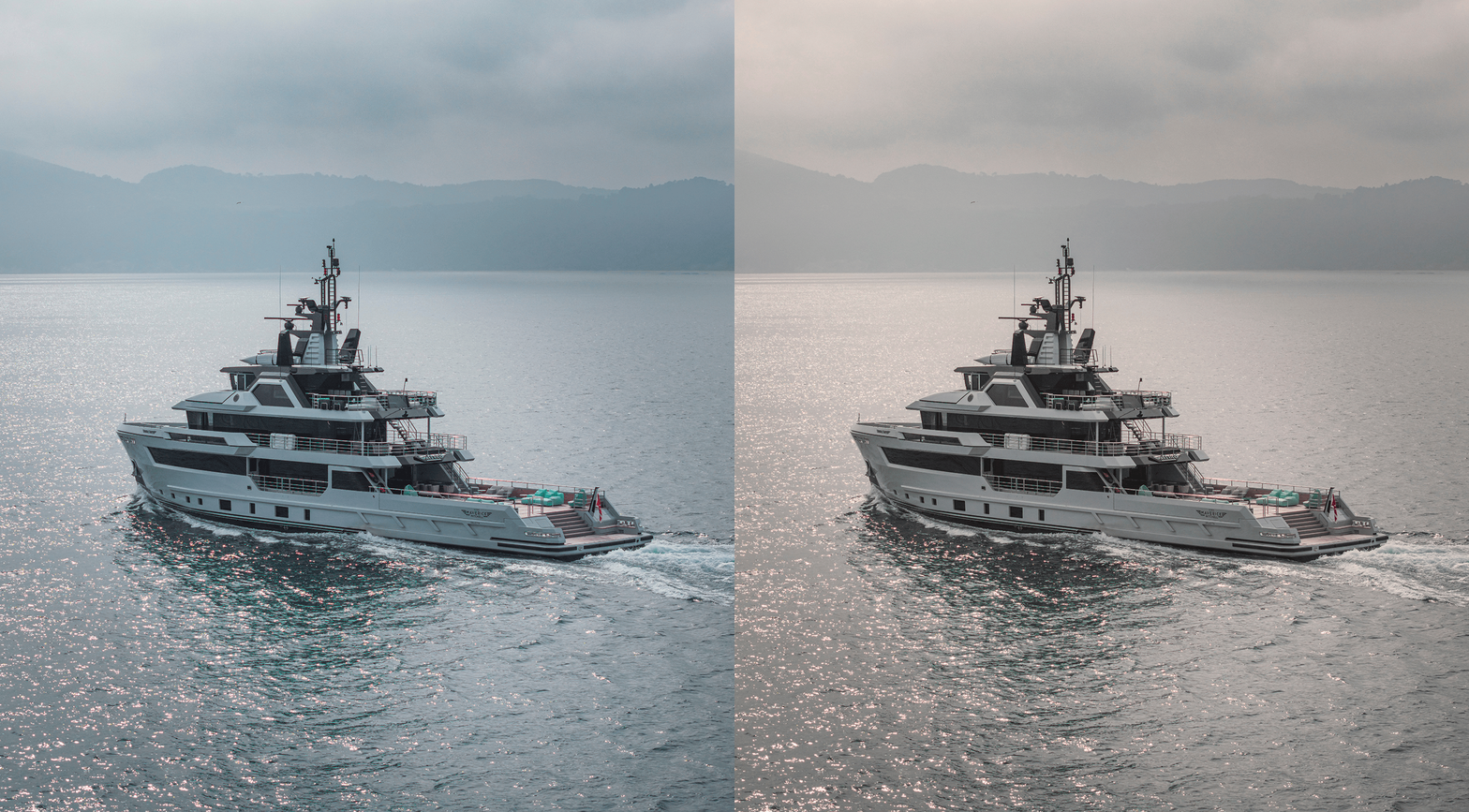
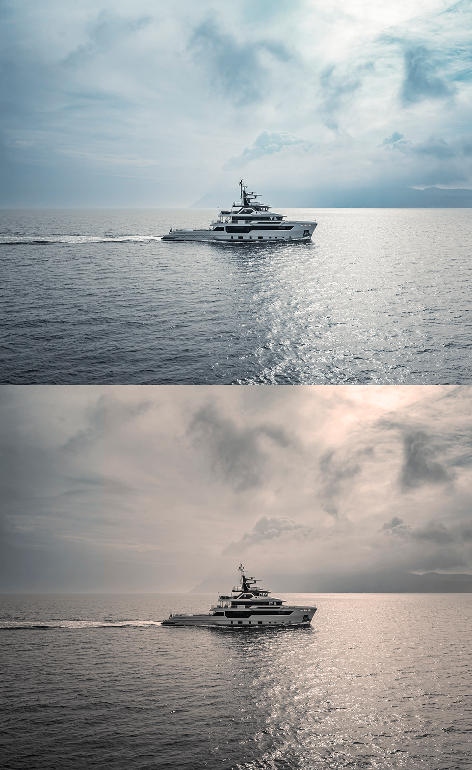
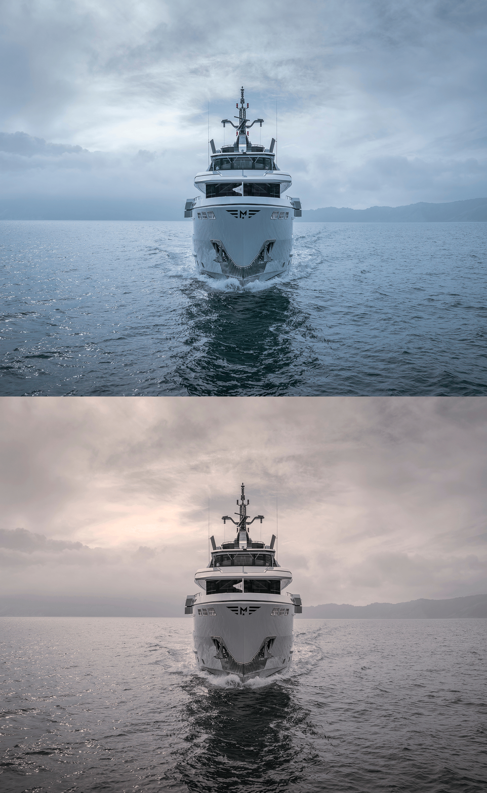
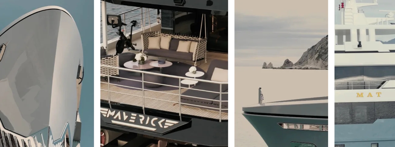
The photographic treatment marks the transition from formal perfection to visual truth.
Darker tones, deeper light, essential composition: the yacht is felt before it is seen, the sea becomes a source of tension once again.
The palette follows the same movement, incorporating the tones of the new treatment and discarding catalog-style contrasts. It is not an aesthetic direction chosen at a desk: it is the real condition these boats are designed to endure.
2012 - 2025
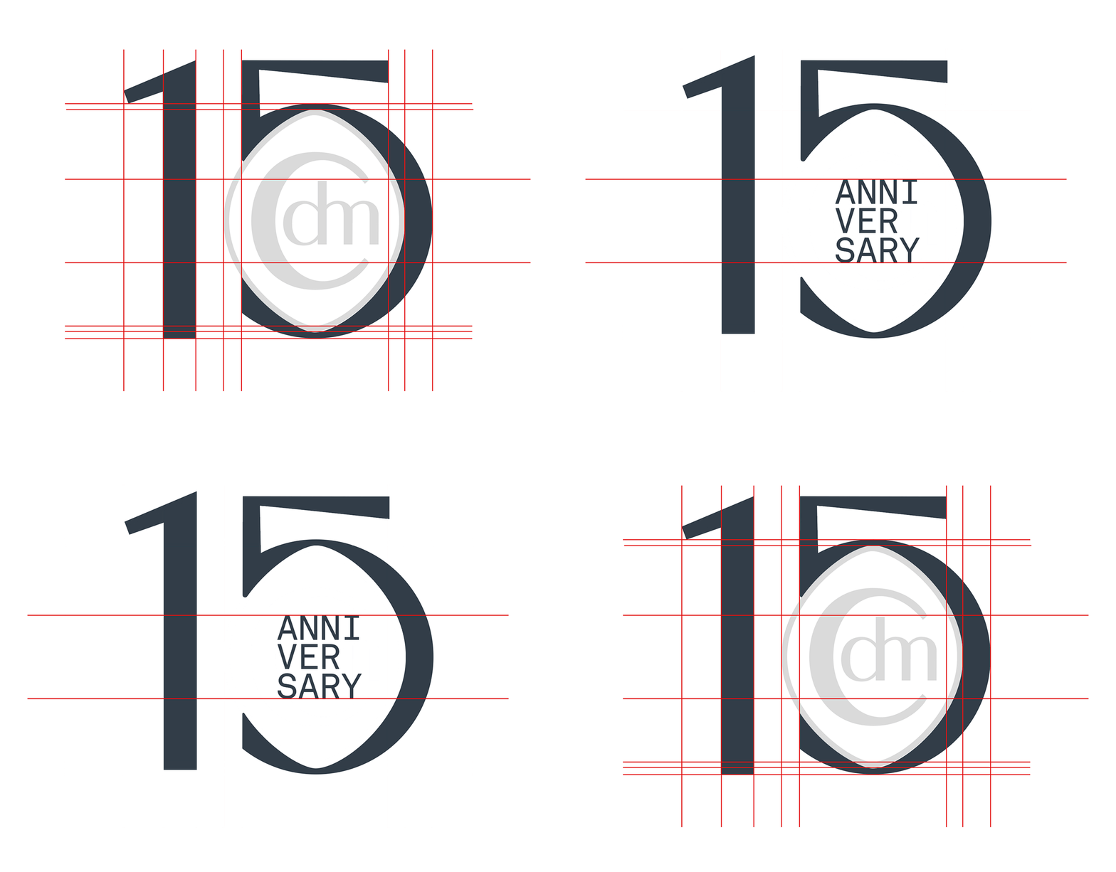
Fifteen years told without anniversary rhetoric.
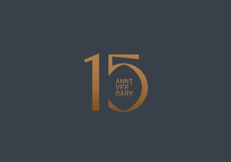
15-Year Logo
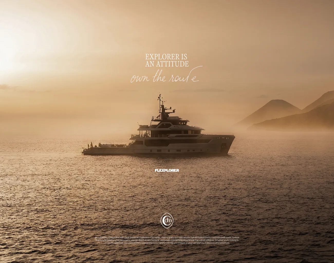
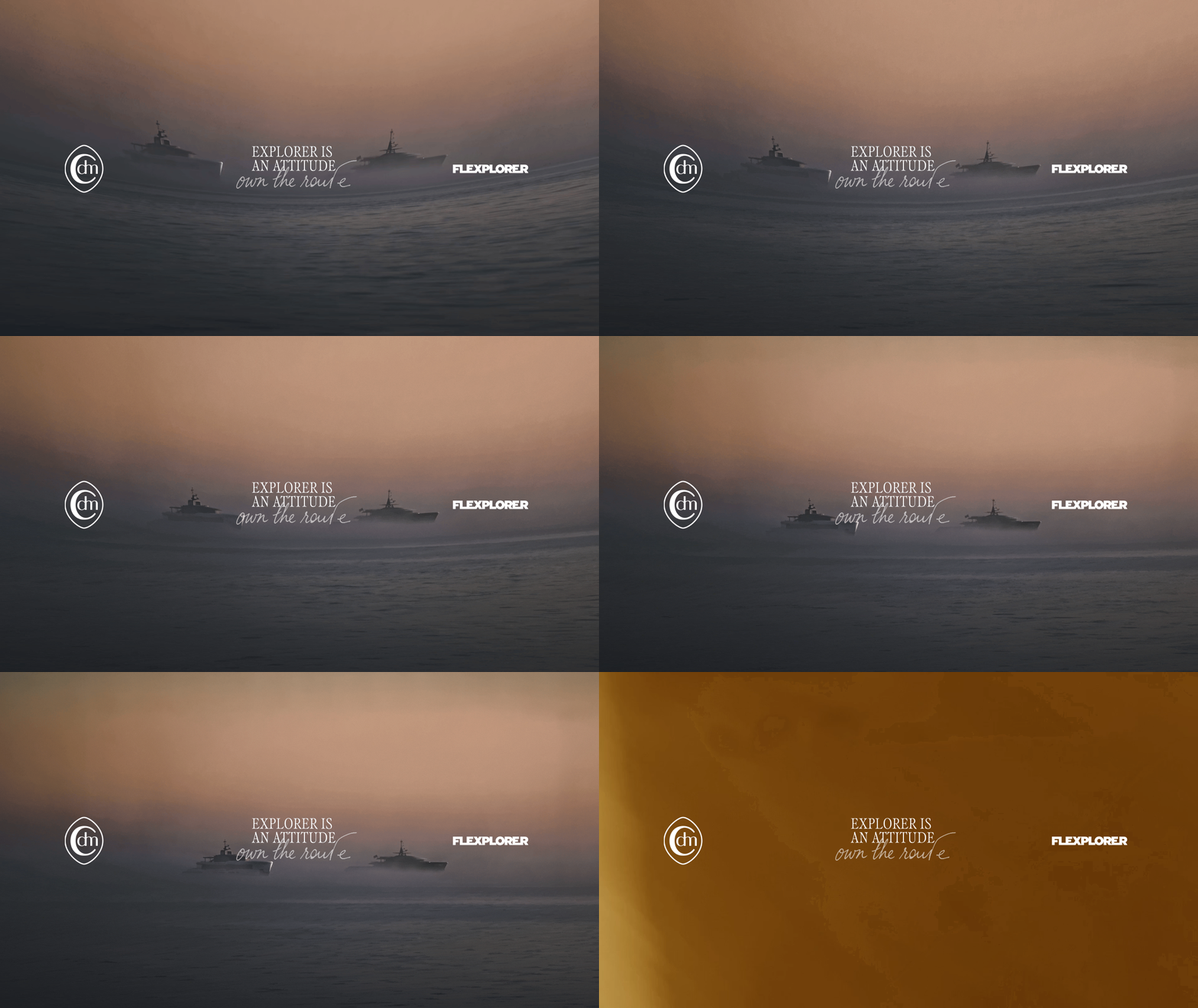
The campaign stems from the same principle underpinning the identity and serves as its public verification. No performance promises, no aspirational imagery: the ad shows a boat at sea and states a position. Italics convey the personal part of the message, while serif carries the assertive part. The text is kept to a minimum because the photography, in its new treatment, is already telling the hardest part.
Advertising
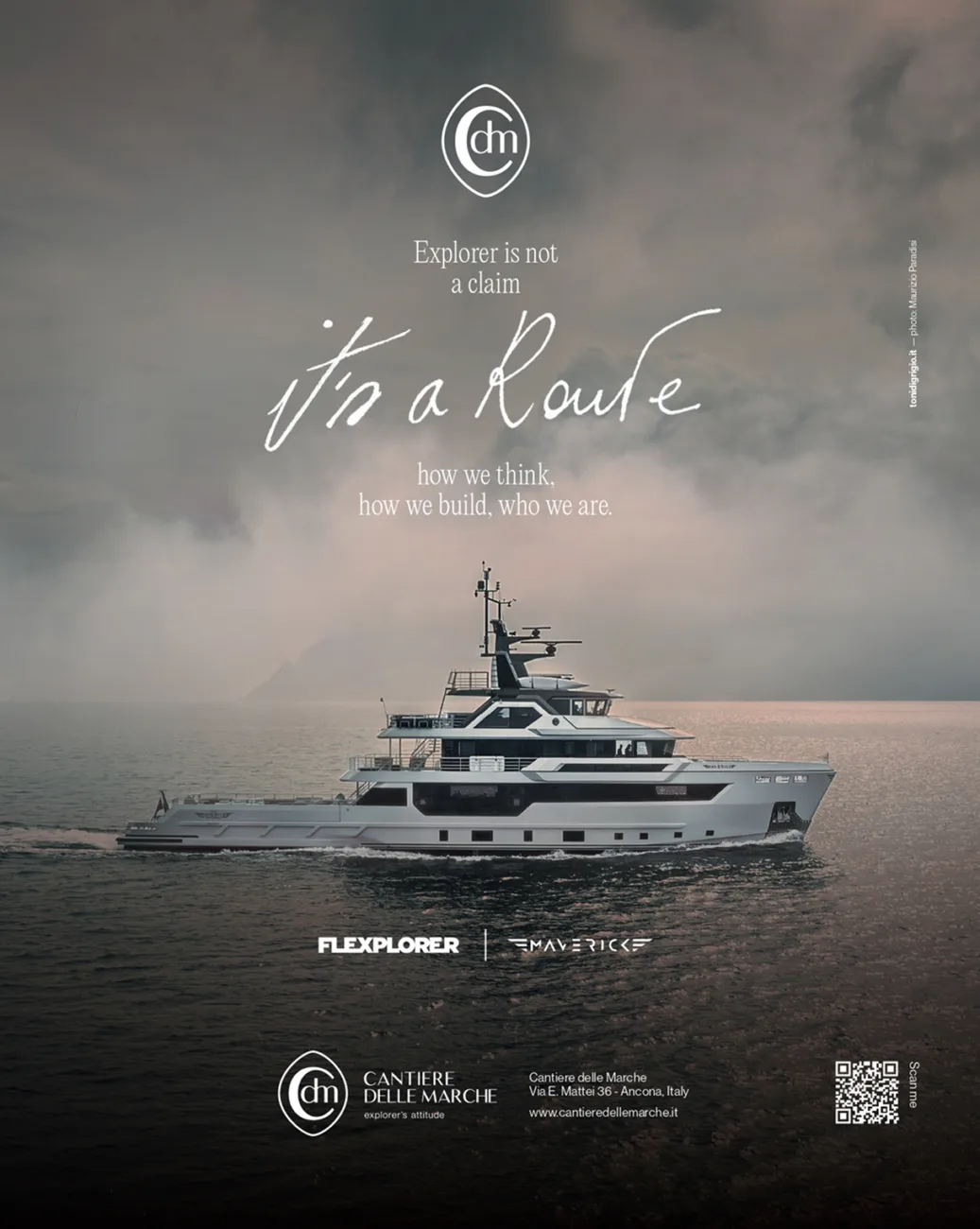
Explorer is not a claim. It's a route.
A campaign that does not promise: it states.
2025
The campaign is built on the same principle that underpins the identity, making it a public proof of that idea. No promise of performance, no aspirational imagery: the ad shows a boat at sea and takes a position. The italic type carries the personal side of the message, while the serif delivers the statement. The copy is reduced to a minimum because, with the new treatment, the photography is already saying the hardest part.
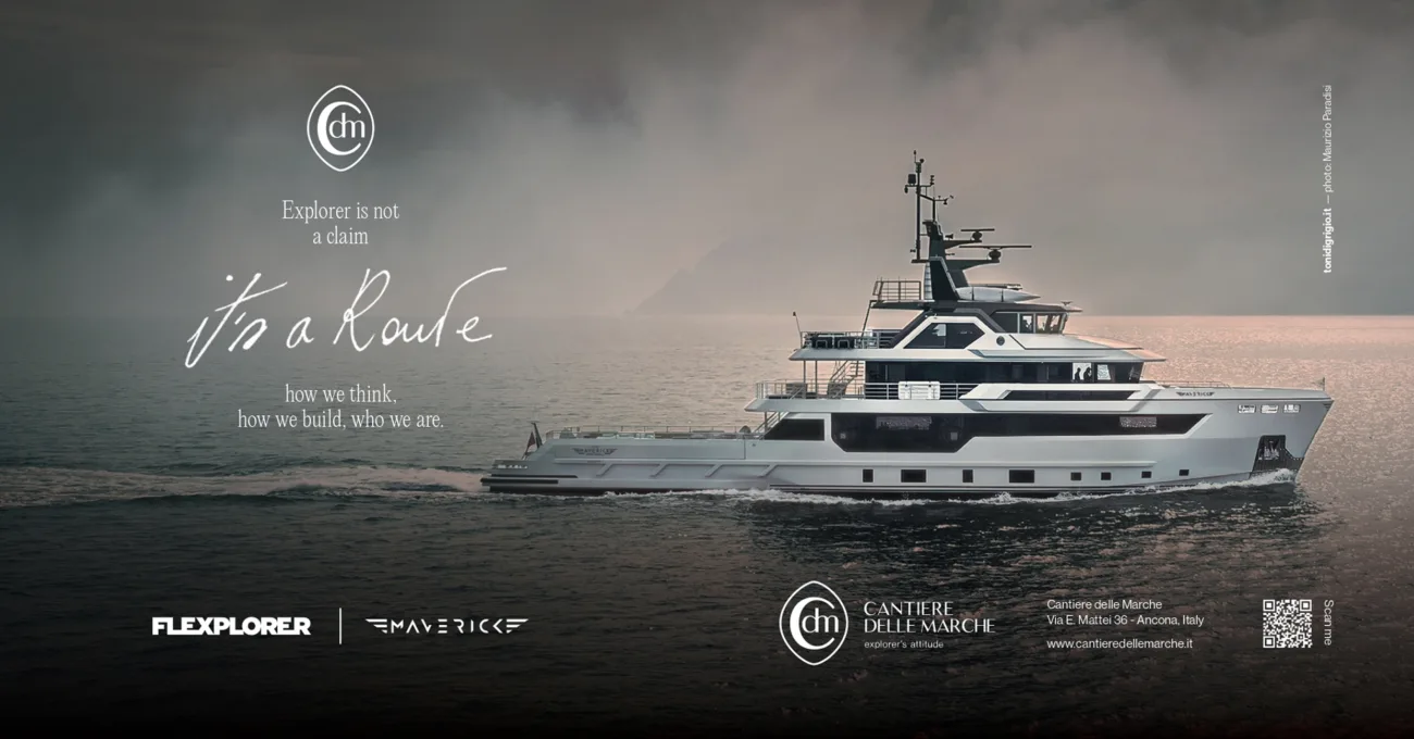
2026
The campaign stems from the same principle underpinning the identity and serves as its public verification. No performance promises, no aspirational imagery: the ad shows a boat at sea and states a position. Italics convey the personal part of the message, while serif carries the assertive part. The text is kept to a minimum because the photography, in its new treatment, is already telling the hardest part.
Website
Every yacht is a project in its own right:
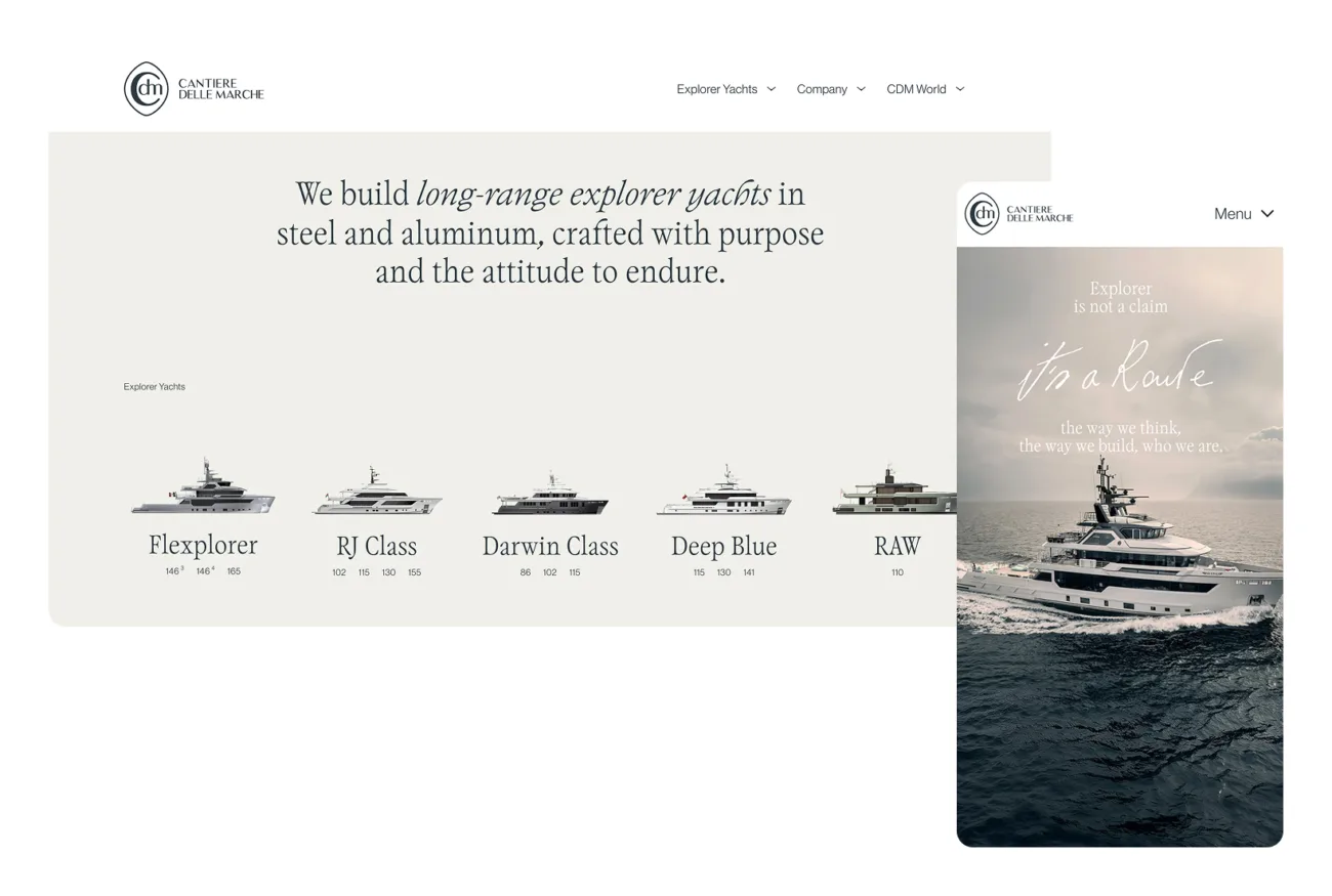
the website presents it as a waypoint along a route, rather than as an item in a catalogue.
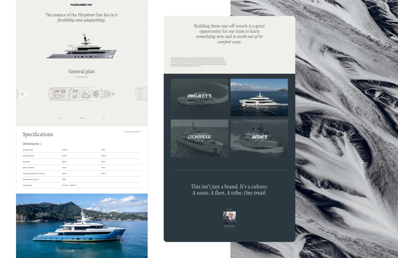
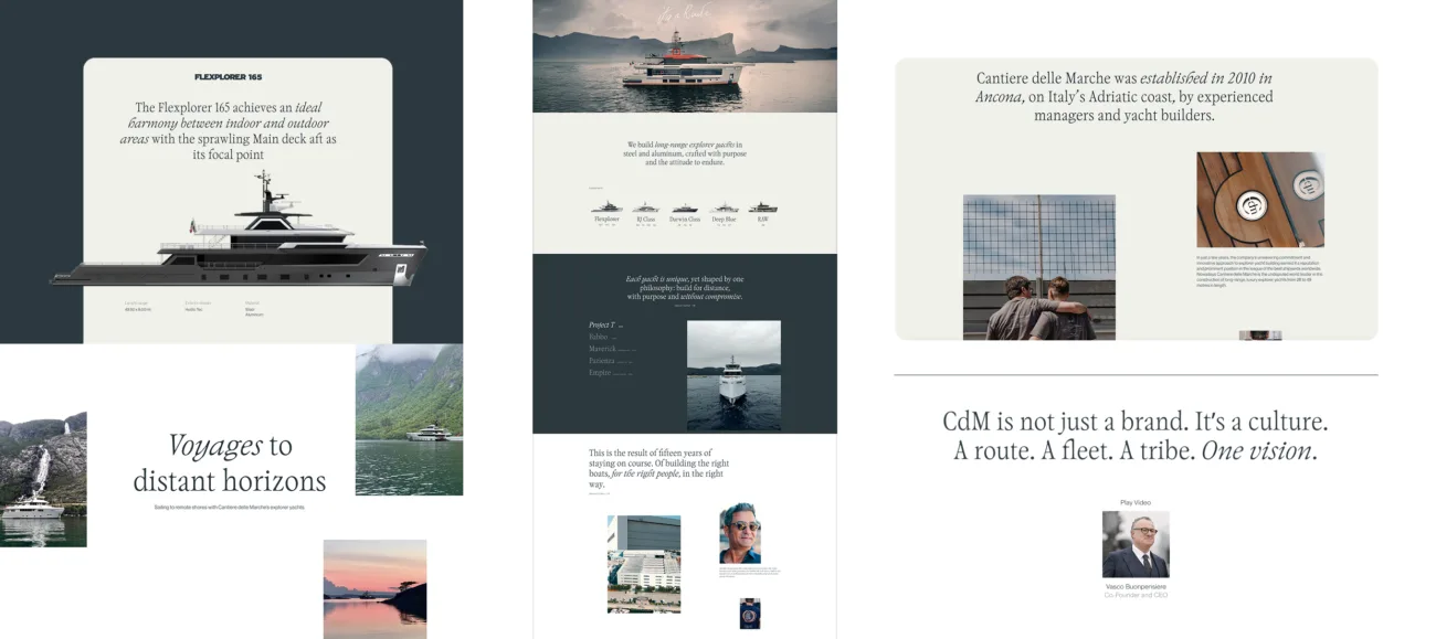
The redesign starts from a reading problem. A shipyard that builds custom yachts risks presenting itself as a collection of isolated projects, or flattening them into a product range. The new website brings these two levels together: the uniqueness of each yacht — its layout, materials, technical solutions, and owner’s story — and the system of choices they have in common. The navigation guides the user from the individual project to the method behind it, and back again.
Experience and structure
The visual system brings the new photographic treatment into the digital space: full-width imagery, copy reduced to the essentials, and typography that alternates between serif and italic following the same logic as the identity system. Sections dedicated to construction and technical aspects move beyond the area reserved for industry professionals and become part of the public narrative, consistently with the principle of correspondence: what the shipyard does should be open to verification.
Route to WSA
Four yachts shortlisted for the World Superyacht Awards:
a series presents them as waypoints along the same route.
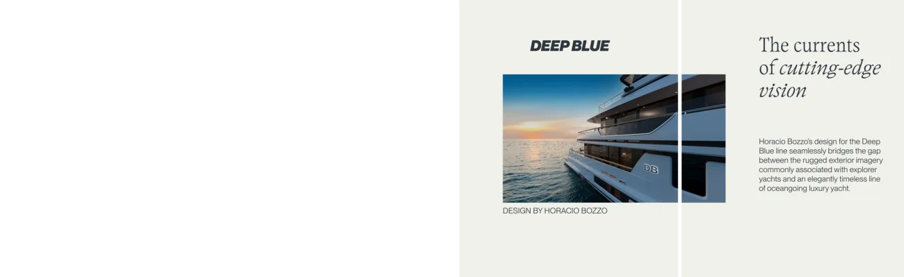
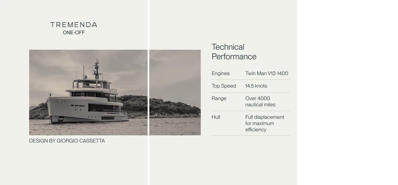
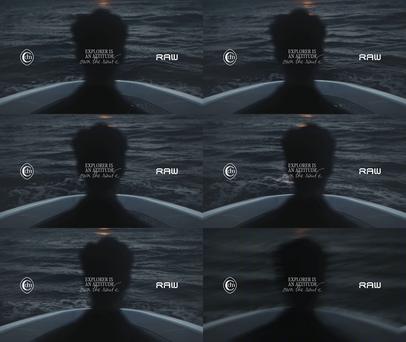
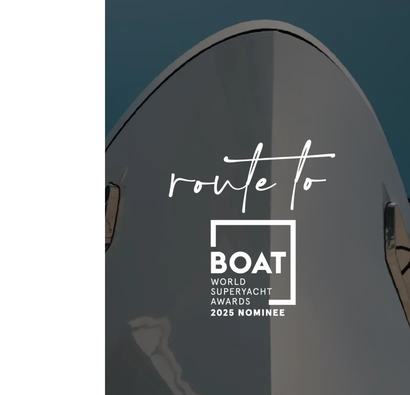
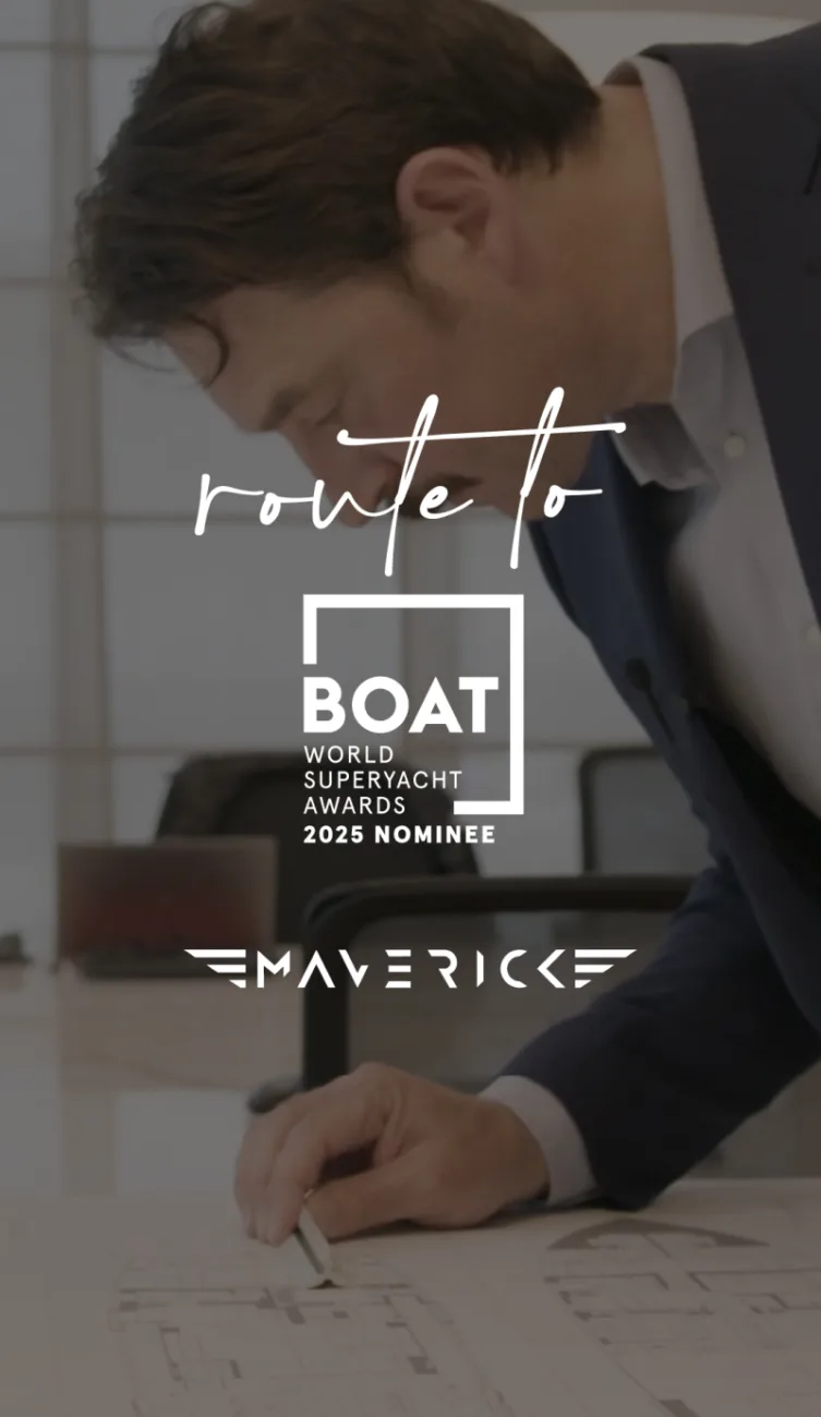
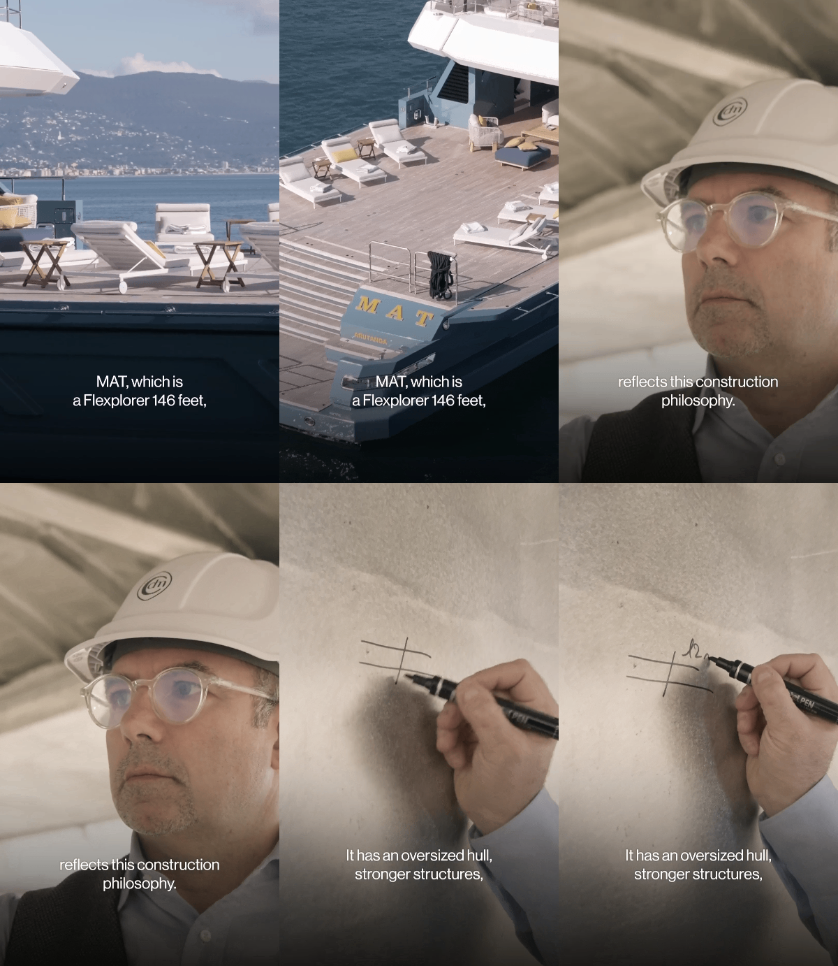
CdM arrives at the 2025 World Superyacht Awards with four finalist yachts, three of them in the same category: displacement motor yacht, 499 GT and under, from 40 to 45.9 metres. Route to WSA transforms the nomination into a narrative journey. Not an awards announcement, but a demonstration that four different yachts can emerge from the same way of thinking. The series follows its own visual language: recurring acronym, photographic treatment, typography and final CTA, adapted to keep the visual dynamic.
Social
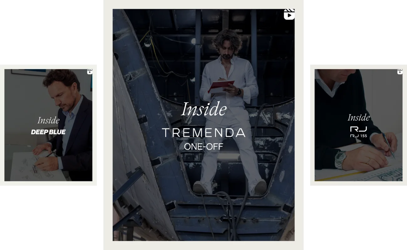
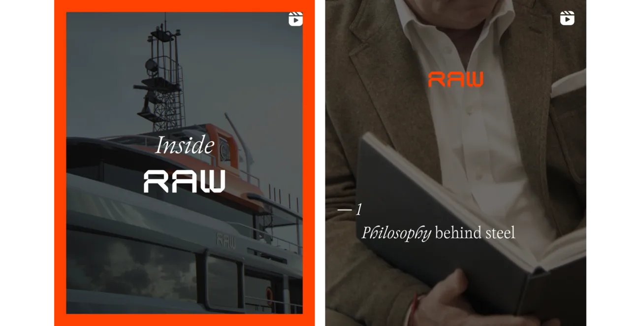
Four narrative threads, one shared voice:
the channels become the place where correspondence is verified every day.