An identity project that gives a forgotten place back to Fabriano.
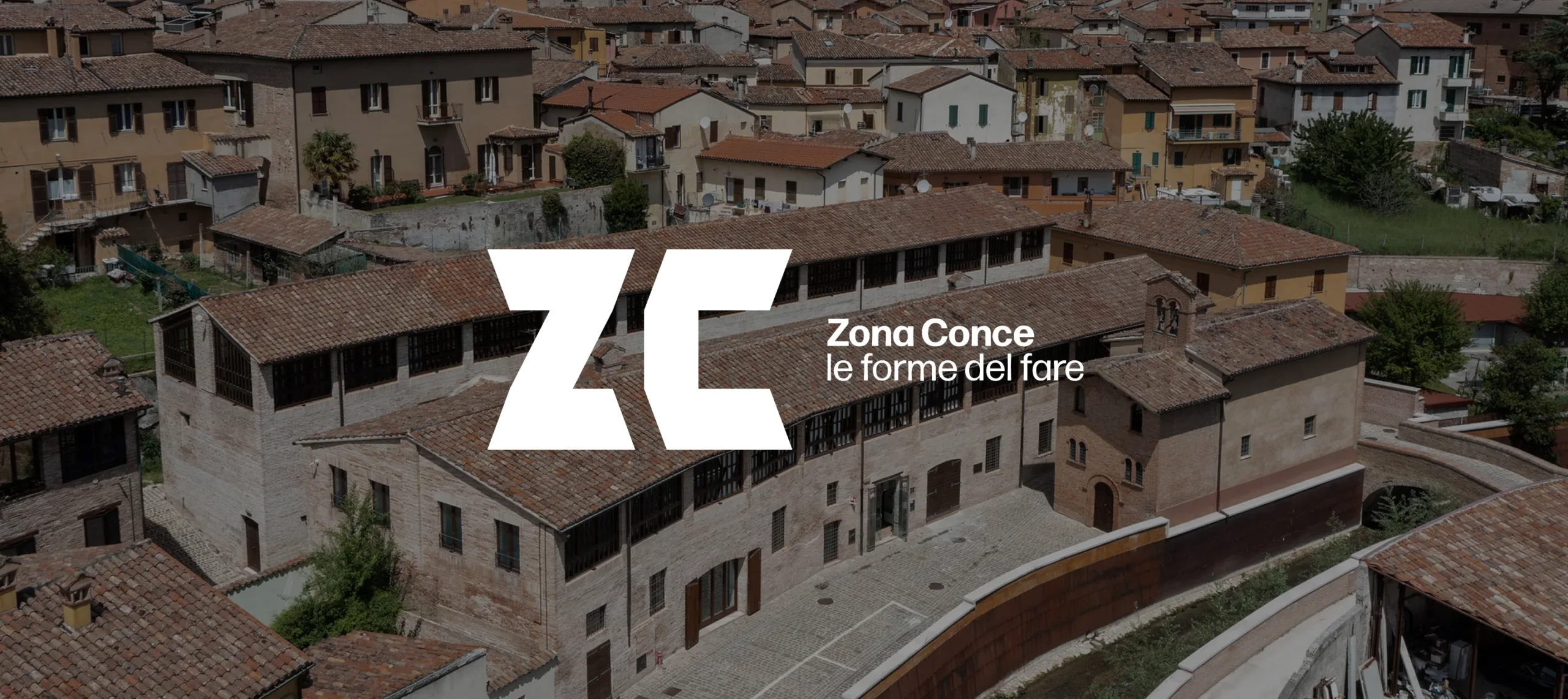
Zona Conce was born from the redevelopment of the former tanneries complex in Fabriano, promoted by the Fondazione Carifac. Inside, it houses a paper workshop, the Edgardo Mannucci-Quirino Ruggeri museum, spaces for training, a craft shop, and dining: diverse places that once again belong to the city. The project builds the identity of this cultural hub from scratch—from naming to payoff, from logo to visual system, all the way to museum signage.
The project was selected and published in the ADI Design Index 2022
Services
Brand identity
Signage design
Client
Place
Year
Communication cores
Identity of the place
Social and manufacturing identity
Comparing Identities
Identity project
Restoring a name even before a logo:
Zona Conce is born from the everyday language that the people of Fabriano already use to refer to this place.
Name and trademark
The name returns to everyday usage: ZonaConce, with the payoff "Le forme del fare" (The shapes of making) linking form to craft gesture.
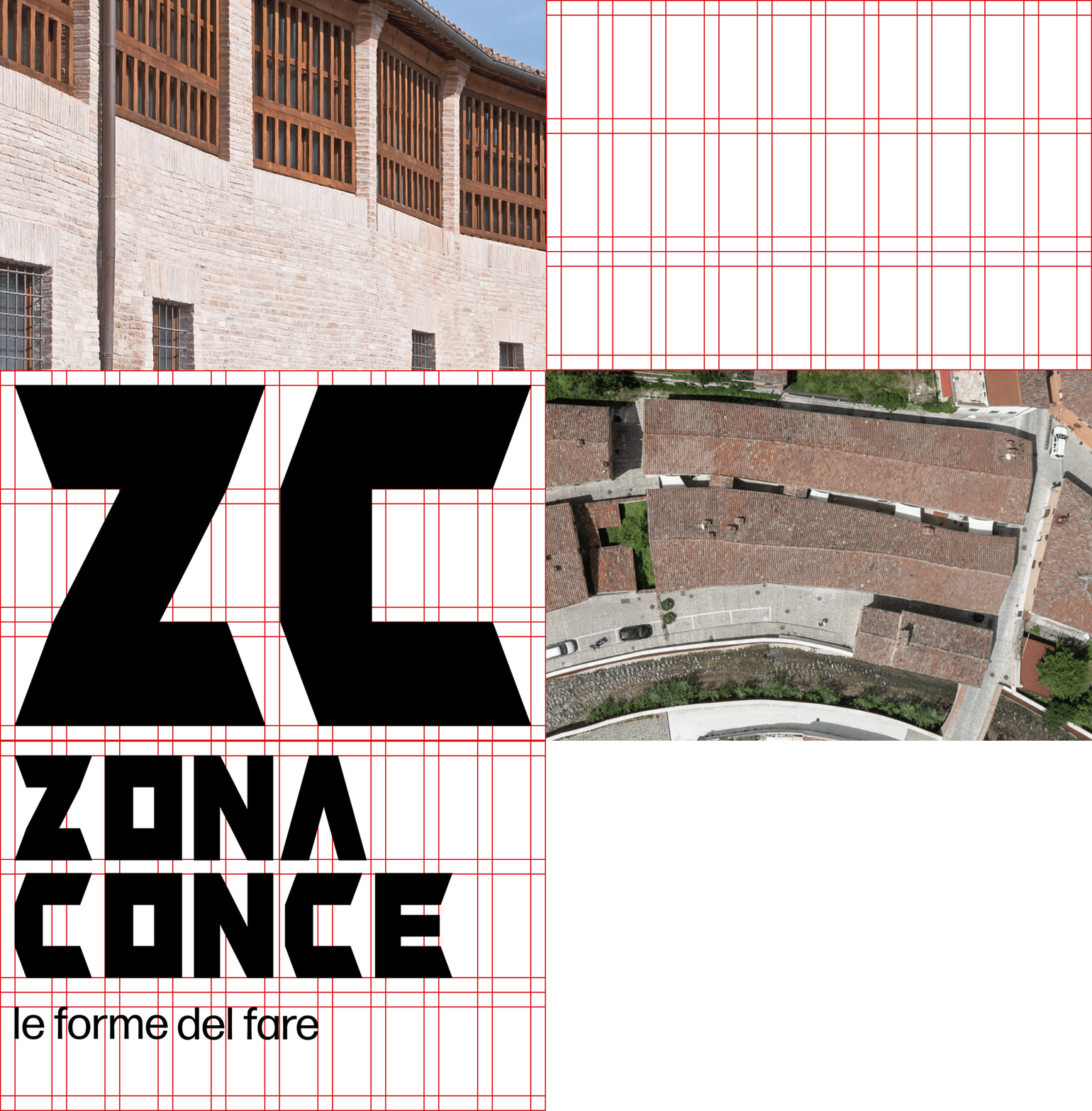
The logo springs from the same dual nature, read within the building's architecture: the wooden masking on the facades, which once regulated airflow for drying leather, becomes the modular grid used to construct the initials Z and C. The space between the two letters recalls the alley between the buildings, while the sharp lines echo the floor plan of the old tanneries.
Basic shapes and typography
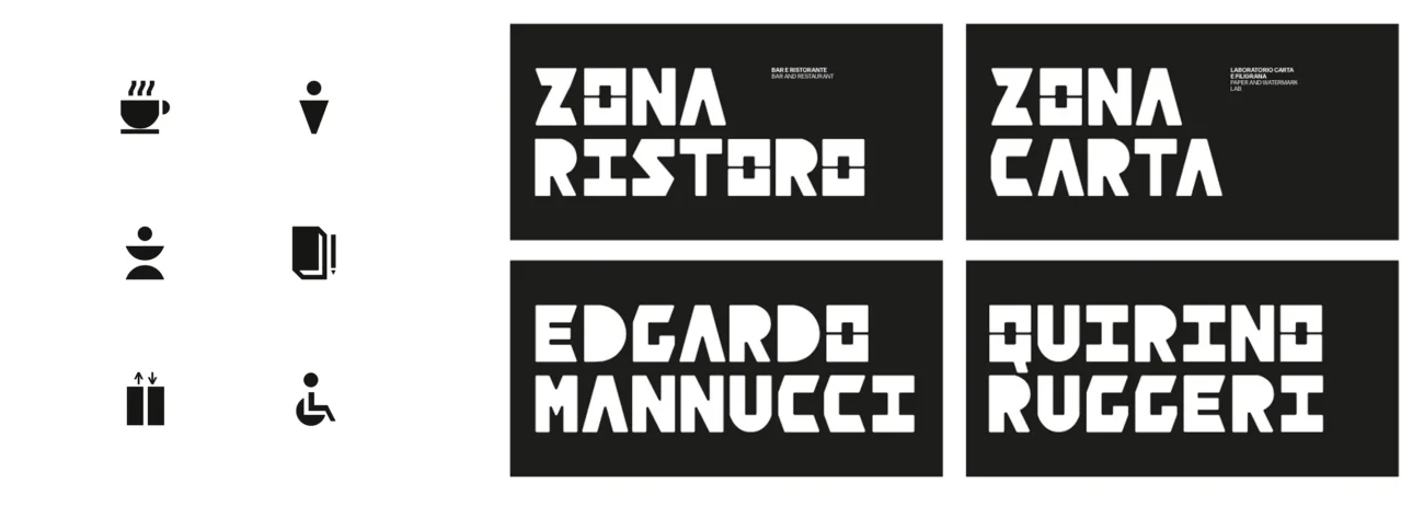
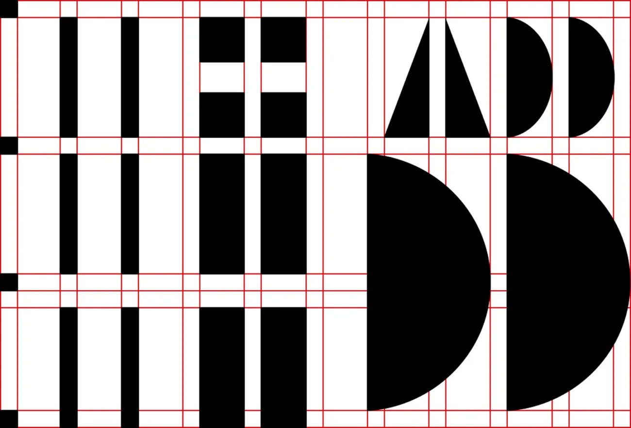
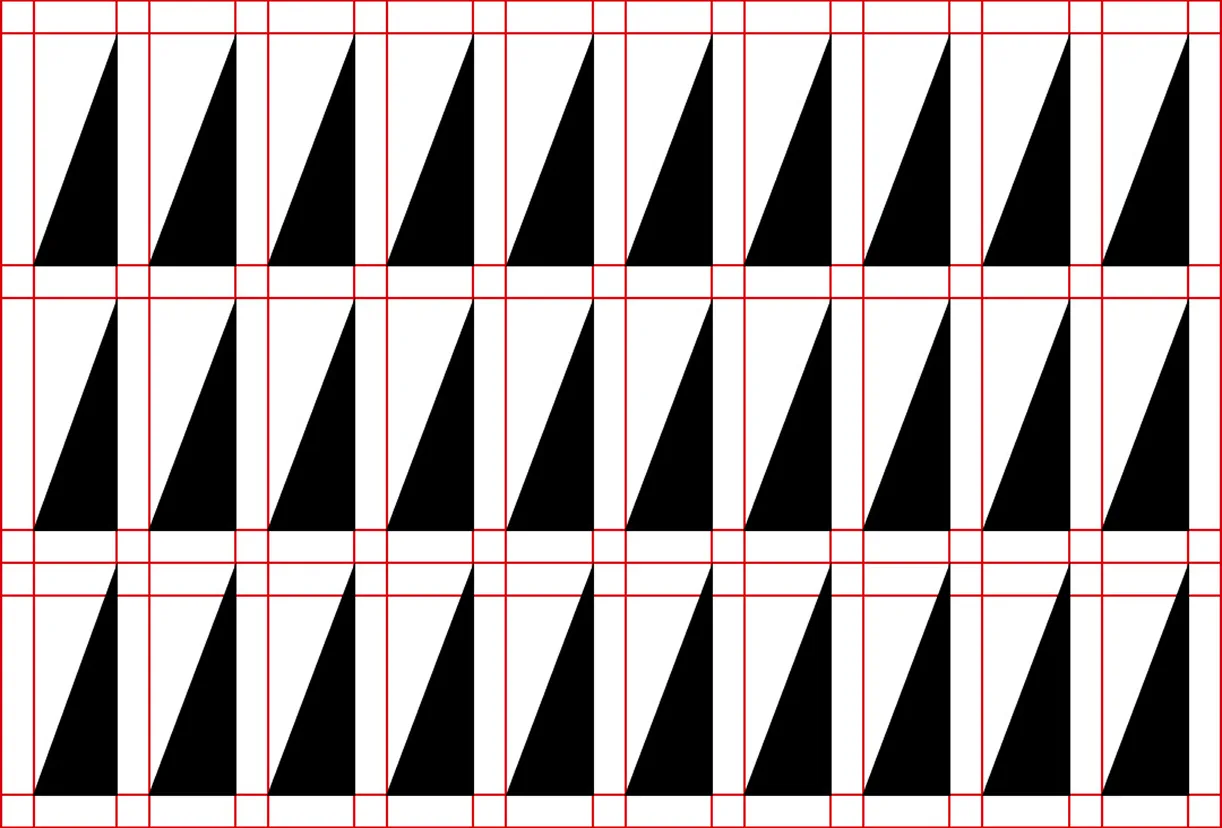
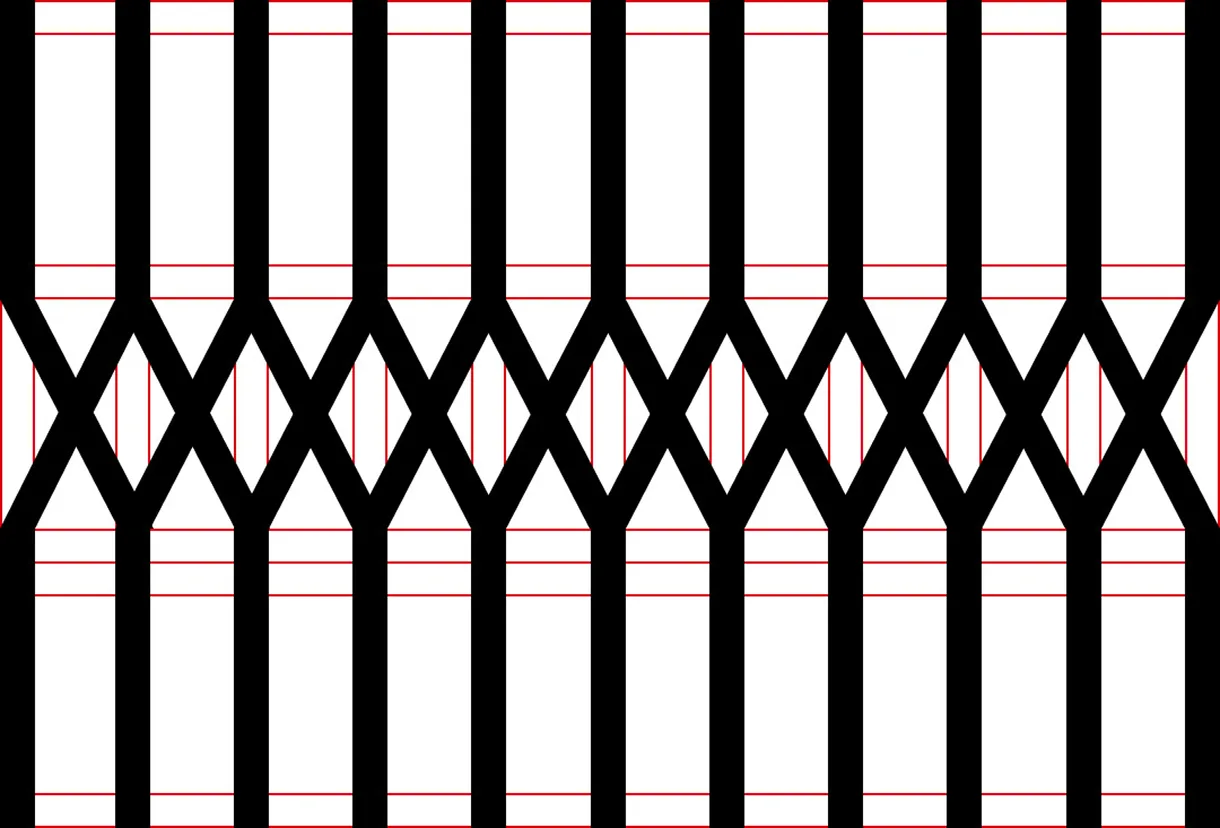
From the modular grid comes a set of basic shapes: the visual vocabulary that generates pictograms, textures, signage, and display elements, all traceable back to the same matrix and therefore perceived as part of a single system.
The same shapes are arranged on the grid to also design the primary typography, a custom font for titles: every letter of the alphabet is thus born from the very same matrix as the logo.
Generative brand
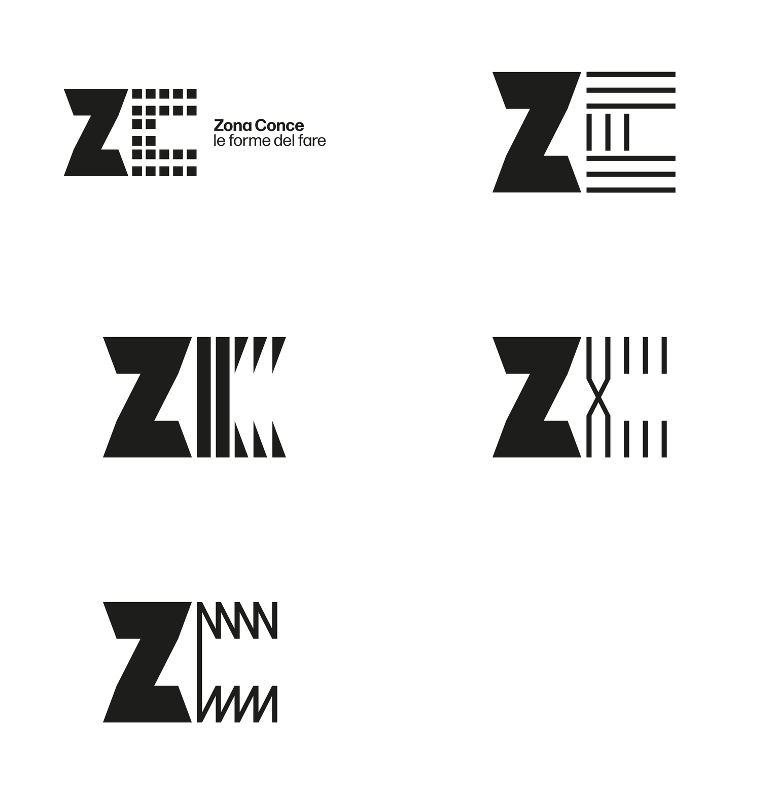
In the perception of the community, the word "Conce" carries more weight than any other. And the word "forme" (shapes), at the heart of the payoff, needs to be seen, not just read. For this reason, we work on the initial "C," fully leveraging the compositional capabilities of the modular grid.
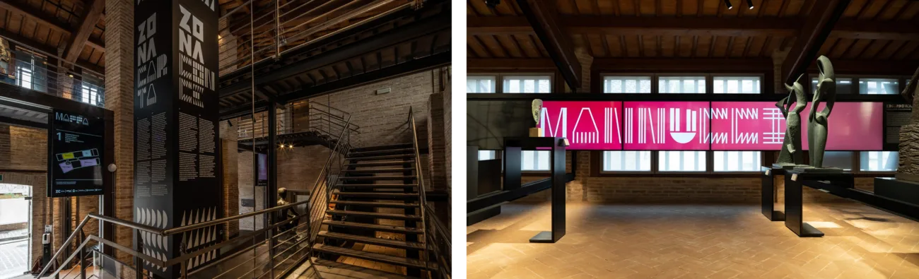
The result is a generative, dynamic logo: it tells the story of a place that must remain flexible to accommodate all the forms of contemporary culture.
Setup
A system designed to extend beyond the logo:
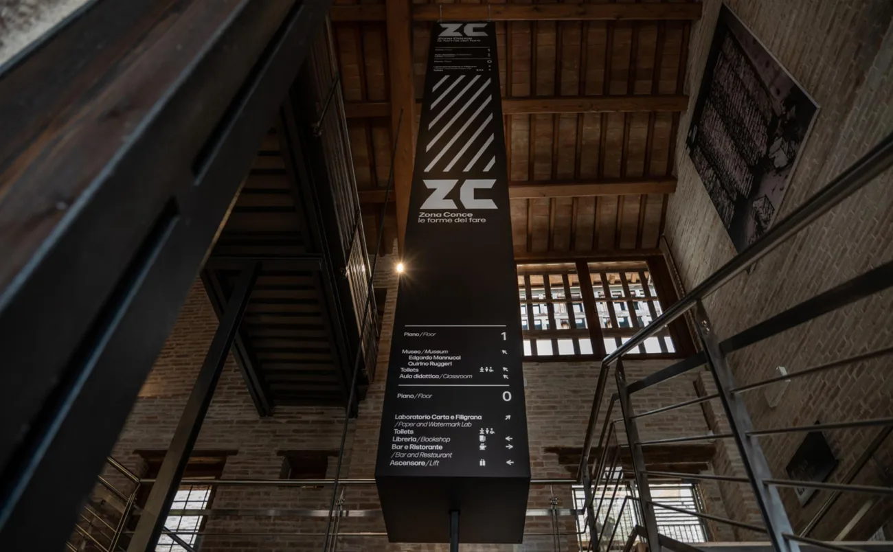
the same generative component becomes museum signage and the multimedia language of the hub.