TONIDIGRIGIO PROFESSIONALS IN COMMUNICATION
BRAND IDENTITY
FLOWING
EXTRATEGY + IDEATO
CESENA (FC)
2019
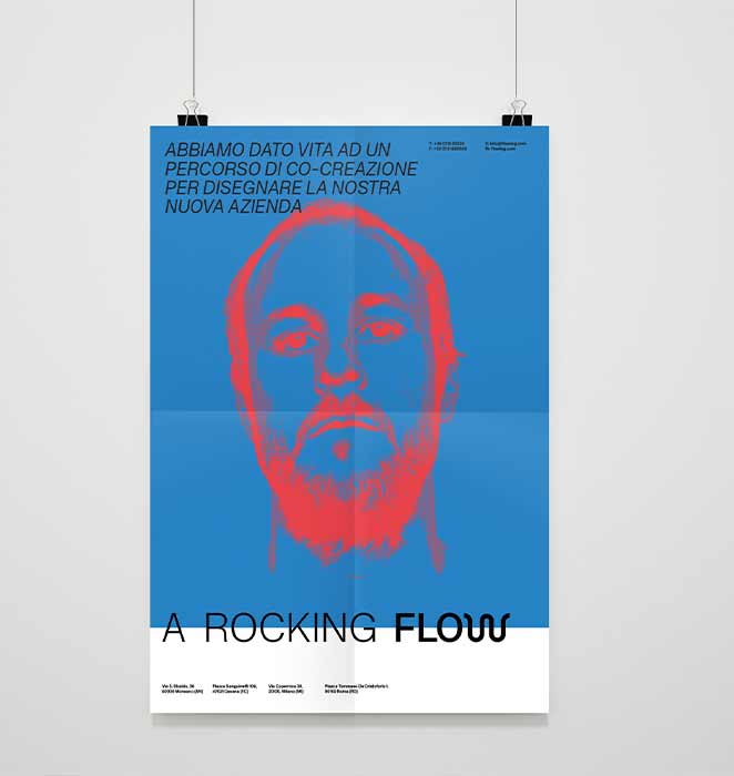
Extrategy and Ideato, two companies specialized in the technological field, have decided to come together to create a new reality. Both the companies share methodological aspects related to lean philosophy and the concept of open governance which make all the people involved in the structure an active part also in the choices and the developments of the company.
Faced with a process that began in 2017, both companies and their employees shared not only an overview but also the shared organizational aspects that laid the basis for the structuring of the new company.
PREREQUISITE
The research began with the analysis of the symbology belonging to the communicative language of the two companies with the aim of determining a common denominator useful to start a propositive process.
Slash indicates an alternative choice between two or more terms. In mathematics, two slashes indicate two parallel lines (shared direction).
The asterisk, indicates a transitive and reflexive closing of an operation, is a point of reference (it explains well the things that you do not understand).
AND PEOPLE
TO THE CUSTOMER
→
COMMUNICATION CORES
.1 Company and people value
Development as personal growth in the field of culture and beyond. This way of understanding the growth permeates
every phase of the business processes, constituting the main goal for the company.
.2 Common growth
Growth (customers and employees) is focused on improving the company’s internal and external activities.
.3 Project value to the client
Every project is an opportunity for common growth. The operational phase of the work creates the conditions
to build value in synergy with all stakeholders involved. At the same time it modulates the management of activities,
training and the transfer of know-how in an inclusive way, a constant and dialectical process of listening and sharing.
The development of communicative language
emerges from the binomial between concept and object.
This dual soul allows a shared narrative
of the two realities.
NAMING
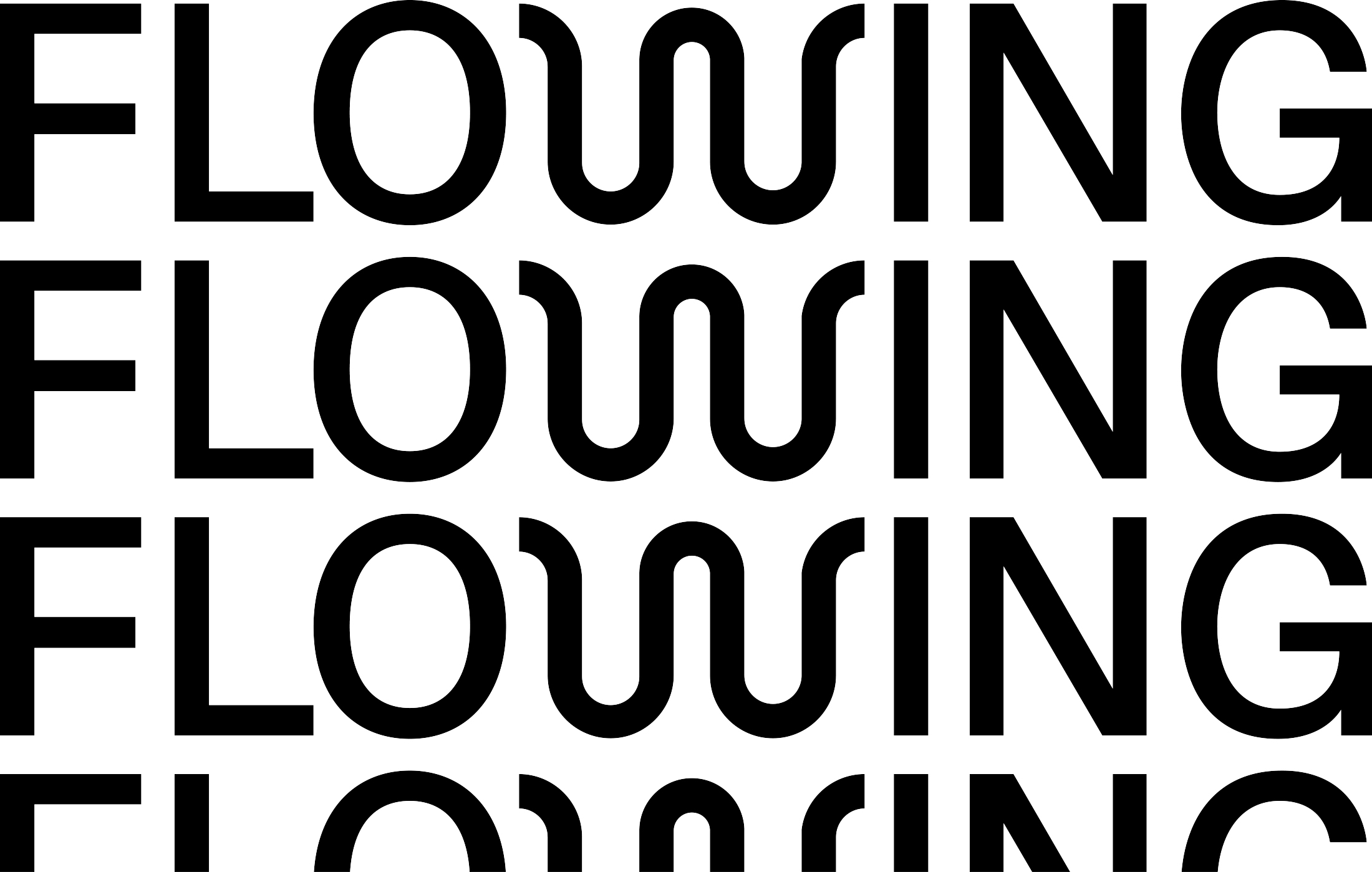
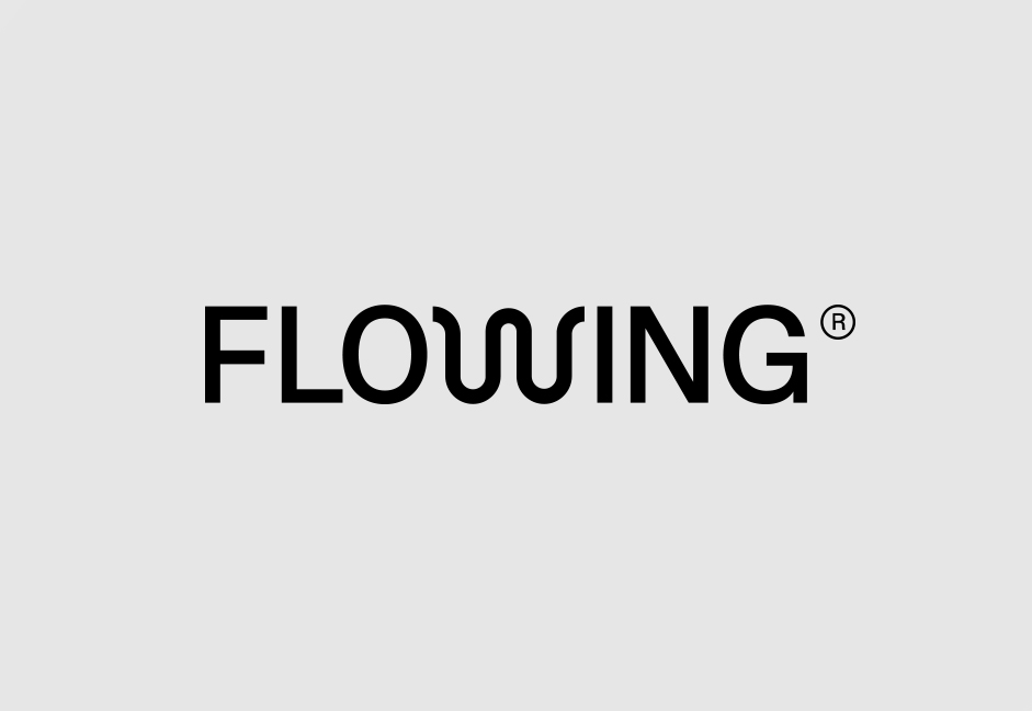
Naming is a talking element, precisely because in a word it condenses a multitude of contents. Instead of uploading it with additional superstructures, and additional elements that should be decoded and that risk slowing down the sense, we chose a family of fonts that ,through the possibility of formatting, leave new perspectives open. At the same time, we felt the necessity to highlight a strong identity element, but this element could not in any way accompany the name. The identity element necessarily had to live within it. We highlighted the W because it’s an element which lends itself to human intervention and interpretation. It is an element that vibrates, that is mobile and that is never self-contained. The logo is the result of the elaboration of the Flowing internal team, in particular of Filippo Giannesi.
COLORS
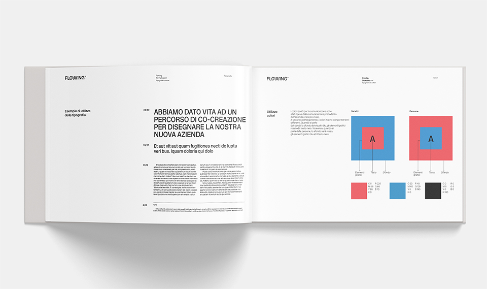
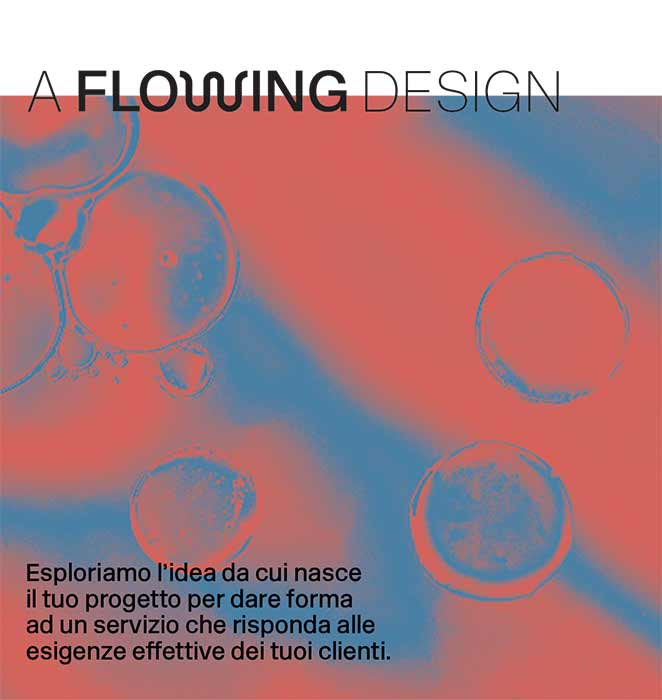
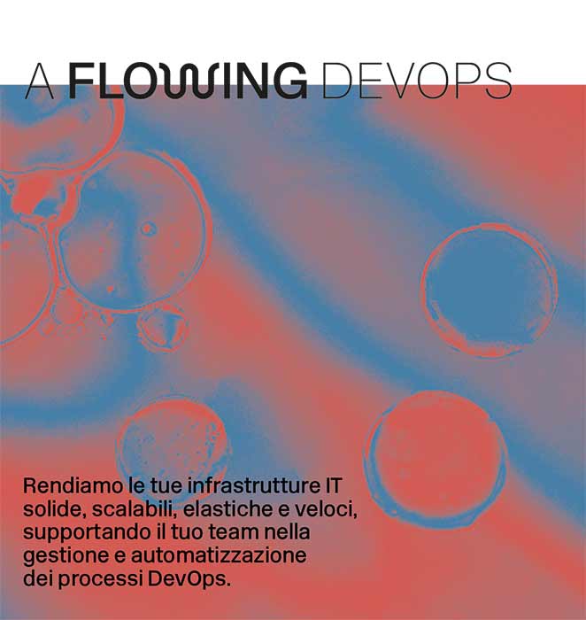
The colors chosen for the communication are taken from the previous communication of the two companies but reinterpreted in a more lively key. Depending on the topic, the colors have different behaviors. When it comes to services, the background of the visuals is blue, the graphics are red and the text is black. Conversely, when talking about people, the background will be red, the graphic elements blue and black text.
RELATED PROJECTS

Related Articles