TONIDIGRIGIO PROFESSIONALS IN COMMUNICATION
BRAND IDENTITY
COMUNE DI CAMERANO
CAMERANO - 2017
The multi-faceted city of Camerano counts a number of tourist attractions that required to be represented by a single brand and logo. We preferred the synthetic thinking over the descriptive sign to represent this heterogeneous content.
TOPICS OF COMMUNICATION
The possibility of isolating a number of communication topics allows us to follow certain paths when setting the subsequent communication operations, slowly building a specific imagery. The topics are summed up in three keywords: territory, tourism and culture.
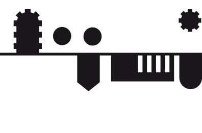
DISTINGUISHING ELEMENTS
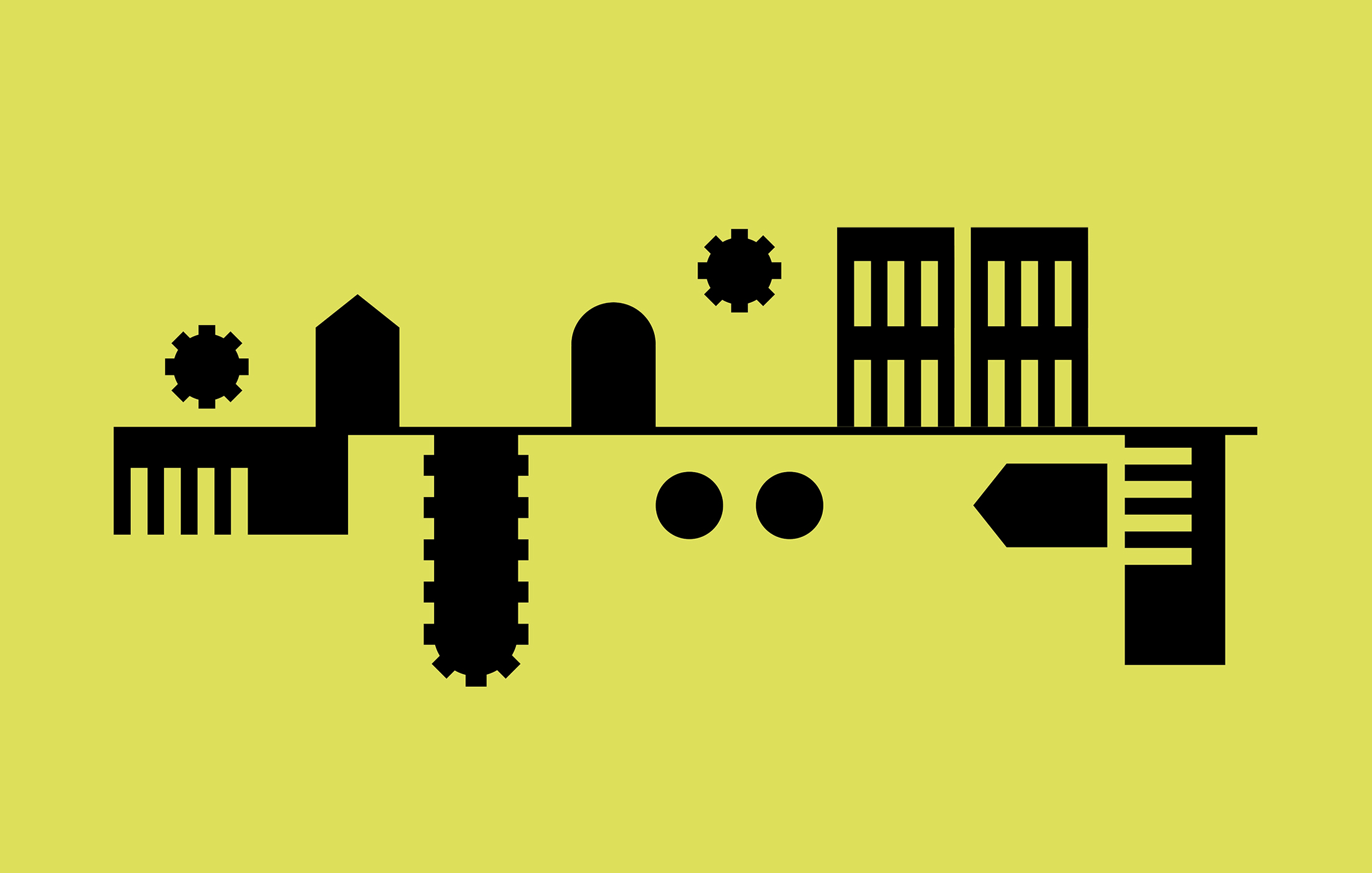
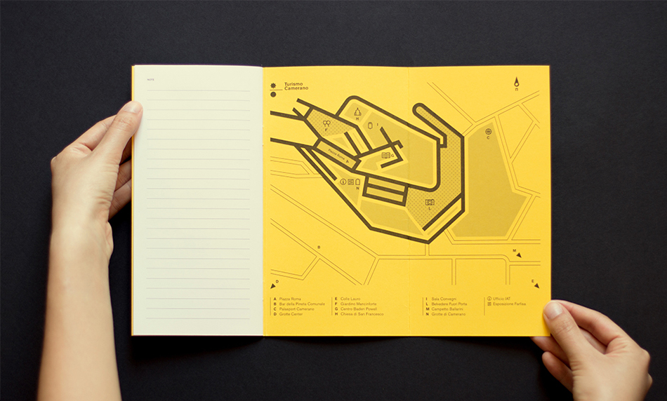
We identified a number of isolable and characterizing graphic elements from the underground city plan. Serrated geometric forms like circles, rectangles and ellipses wellcome the dents both as bulges and cavities.
Another characterizing element is the line representing the Earth’s plane, metaphorically used to divide the geometric forms.
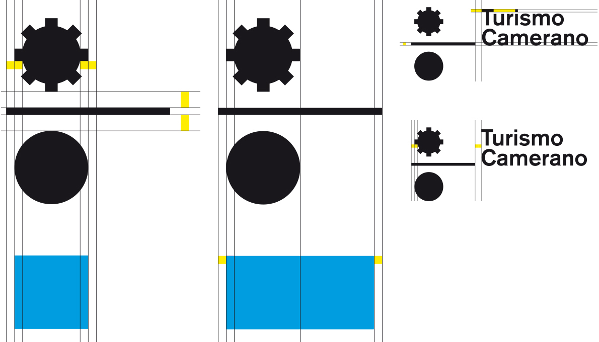
THE LOGO
The serrated circle resembles the sun. The horizontal line of the ground defines what is below, where the plain circle finds its place - the moon, the night light.
The ground line is longer than the dimension of the circles to create tension, an empty and dynamic space that welcomes new declinations.
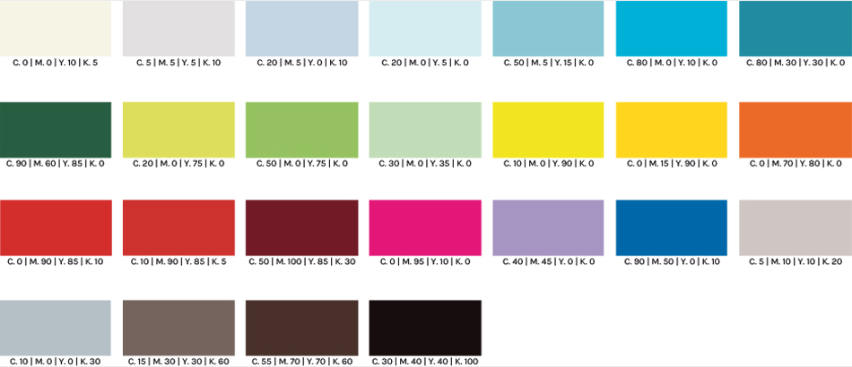
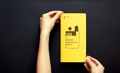
The use of colors is one of the strongest points of the brand identity. The palette is enriched by the choice of the Pop’Set paper by Fresck Picks, featuring a fresh, innovative color range with an undeniable visual impact that ensure its recognizability. This kind of paper will be used for the covers of the various brochures.
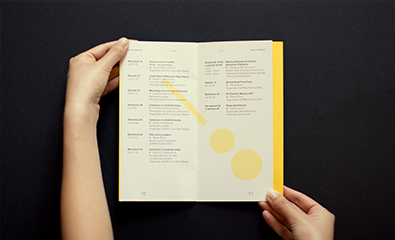
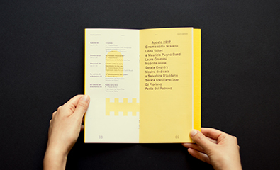
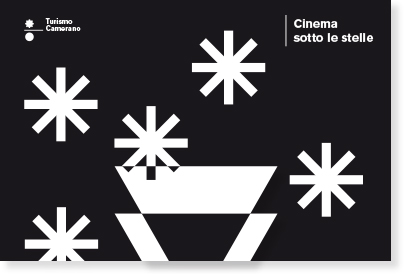
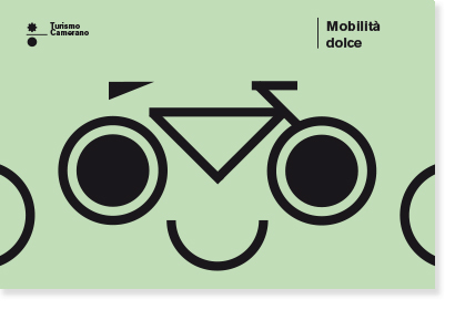
MODULAR ELEMENTS
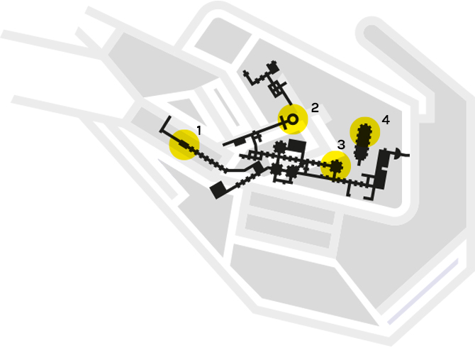
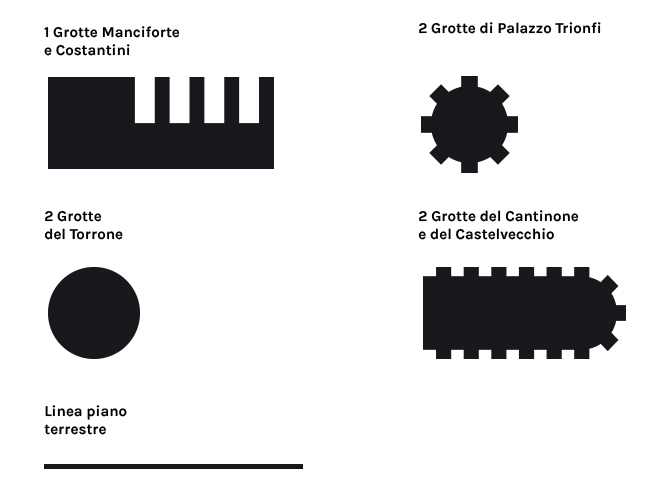
To define the modular elements, we started reasoning on the Camerano Caves plan, an important tourist attraction that gives value to the territory. From reading the plans, we isolated abstract geometric forms, subsequently broken down into minimum geometric elements like circles, squares, triangles and a straight line.
Thanks to the modular grid, these continuity elements combine themselves to create new, always different forms, complementary from the graphic point of view of the communication.
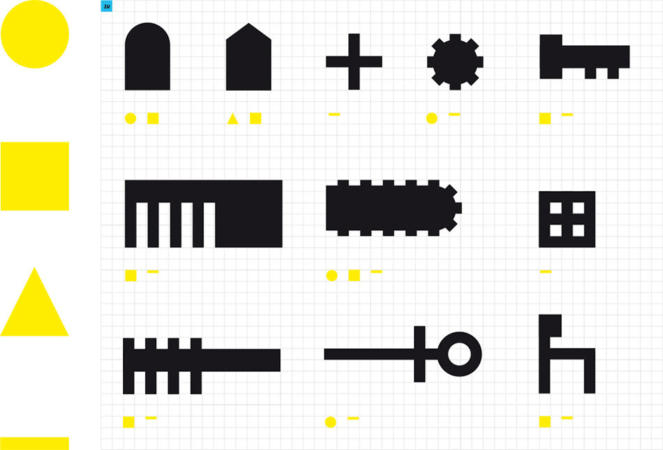
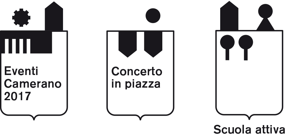
The modular forms will live together with the blazon, telling everytime a different scenario.
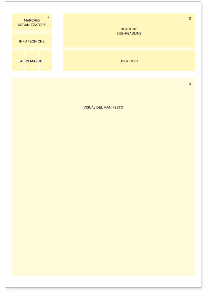
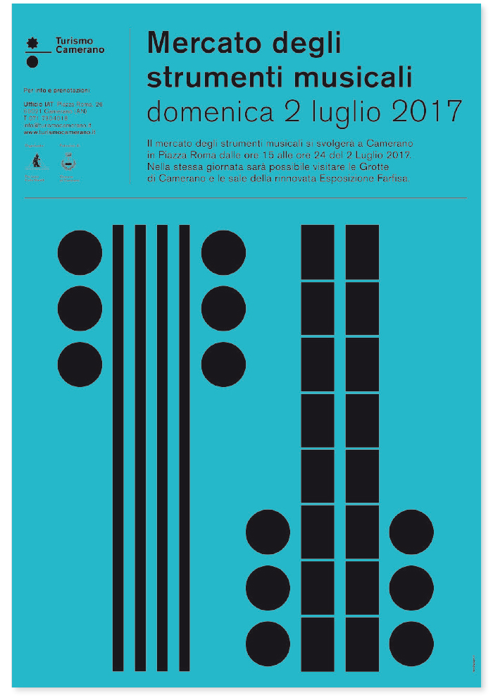
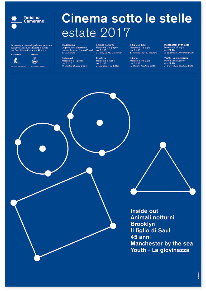
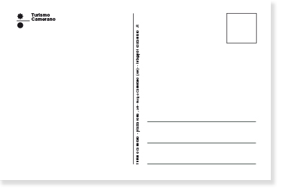
COMMUNICATION TOOLS
As for the communication tools, we focused on the posters’ structure. As it can be seen from the grid, the logo of the organization Turismo Camerano is displayed on the left side, followed by technical information and the partners’ logos.
Title and dates (subtitle) are displayed on the right side, while a short description of the event is placed on the section immediately below. This apparently rigid format is actually versatile thanks to the modular graphic structure.
RELATED PROJECTS


Related Articles